EspialTV Web Client
Project Overview
EspialTV is an IPTV solution hosted in the cloud, providing a fully managed video services model for over 40 operators. Recently, EspialTV has implemented a web browser version of their app.
For the purposes of this portfolio, focus was placed on the design process of the NDVR Top Level for the web app.
Duration: June 2022 - August 2022
Methods: Secondary and Market Research, Storyboarding, Wireframing and Prototyping, Component building, Design system
Type: Work Project
Design Brief
When designing the NDVR Top Level, there were several guidelines to abide by, as the app already existed across multiple platforms including AndroidTV, AppleTV, Roku, iOS mobile, and Android mobile.
Goals & Objectives
Research & Insight
Firstly, preliminary research was completed on web users and web design systems.
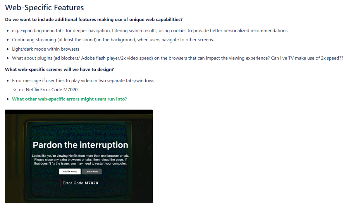

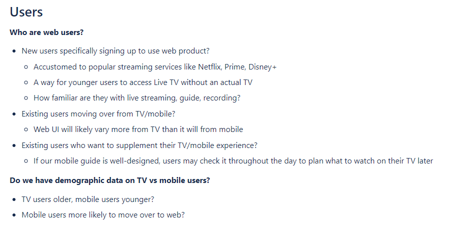
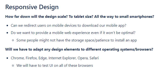
Excerpts of compiled research in Confluence.
Secondly, competitive analysis was completed. Streaming services with existing web NDVR platforms, such as Bell Fibe were examined to determine the key features.
Ideation
Low fidelity prototypes were then completed on paper before evaluation.
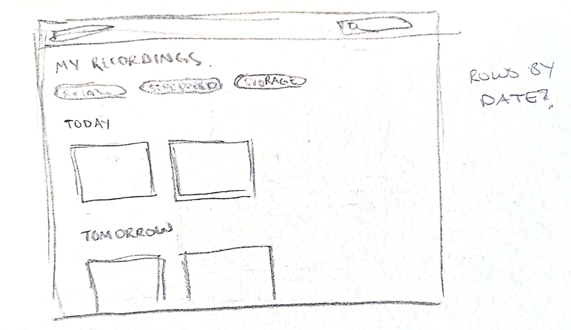
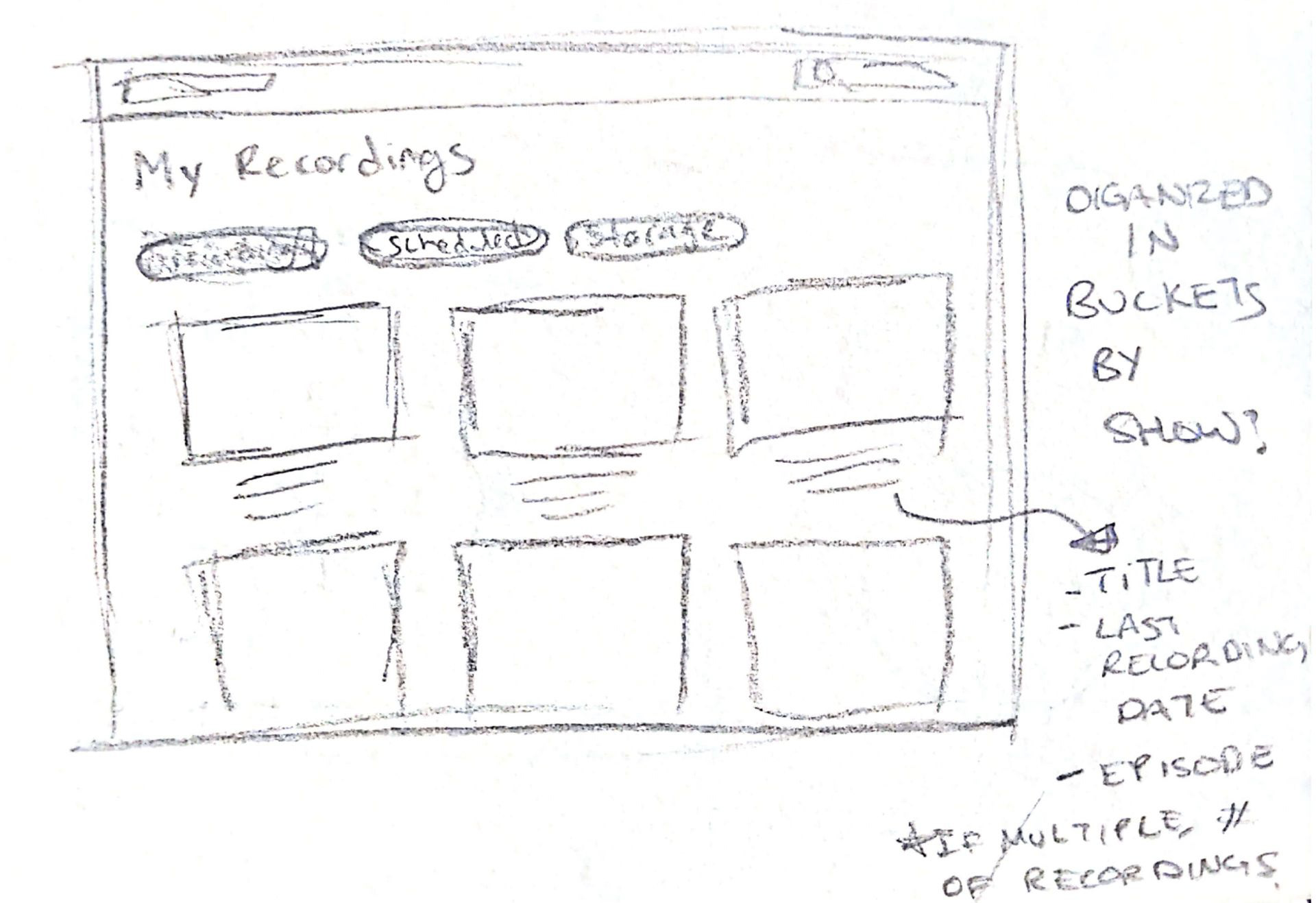
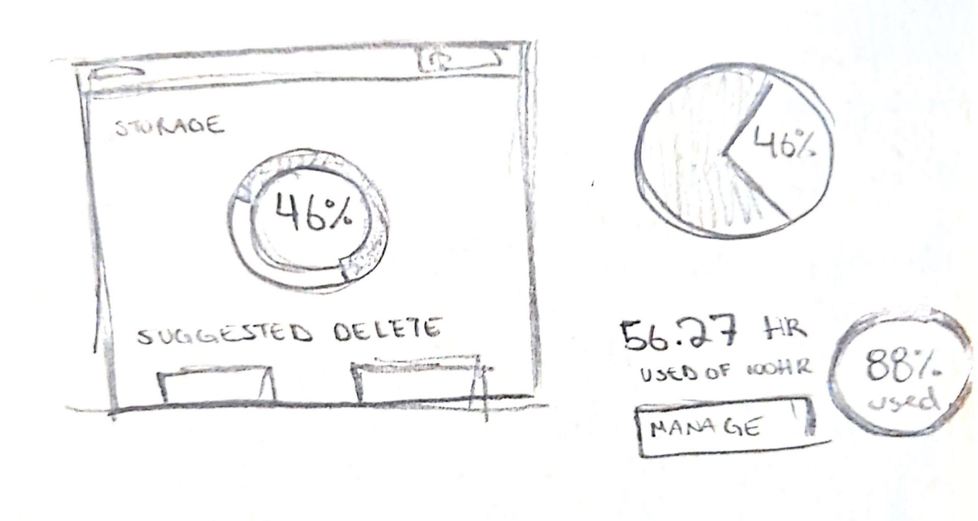
Rough mockups were then built in Figma, using components from EspialTV's existing web design system. The first round of mockups explored the possibility of having a storage tab.
Discussing with the team unveiled the following issues: The Recommended to Delete swimlane would require a lot of developmental logic. What should be recommended? Oldest programs? Programs that were already watched? What if they had expired?
Ultimately, it was decided the developmental effort outweighed the UX benefit of the Recommended to Delete swimlane.
Concept Refinement
The team came to the conclusion that there was no reason to have a tab dedicated to storage. Instead, the following concepts explored having the storage space should be available at all times on the NDVR Top Level.
Including the bar in the header made sense, as a similar header style was being used on other pages. Therefore, the top right concept was chosen to be further refined.
Component Building
With the designs mostly finalized, it was time to begin building components in Figma. As other screens in the app had been developed, there was a design system already in place to build from. The NDVR Top Level required the following new components:
1. Recording Storage Bar
2. Sort Recordings Dropdown
3. NDVR Page Header
Recording Storage Bar Component
The Storage Bar component was built from vectors with text added above. It had a fixed width on all screen sizes.
Documentation of these components for developers was done through callout arrows and text explaining the use case and behaviours of each component.
Sort Recordings Dropdown Component
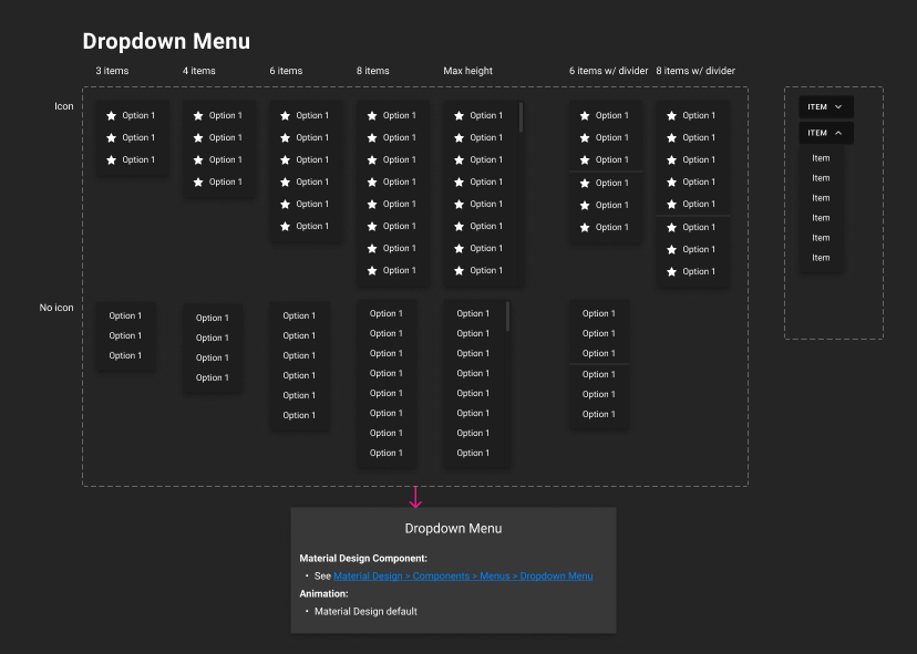
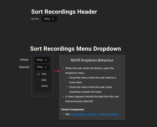
The Sort Recordings Dropdown component was built from a parent menu dropdown component and customized with the NDVR options.
The parent dropdown menu is a Material Design component that was customized for the EspialTV Web app.
Page Header Component
The Page Header component was built for multiple pages in the App, at three different screen sizes. Therefore, three variants of NDVR Page header were created. It was built from the following components:
• Title with Icon
• Recording and Scheduled tabs (both default and focus states)
• Storage bar
• Sort Recordings dropdown
The Page header was built to scale adaptively.
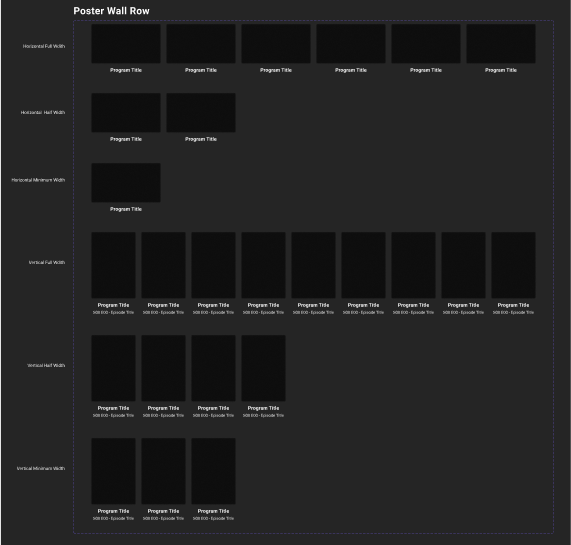
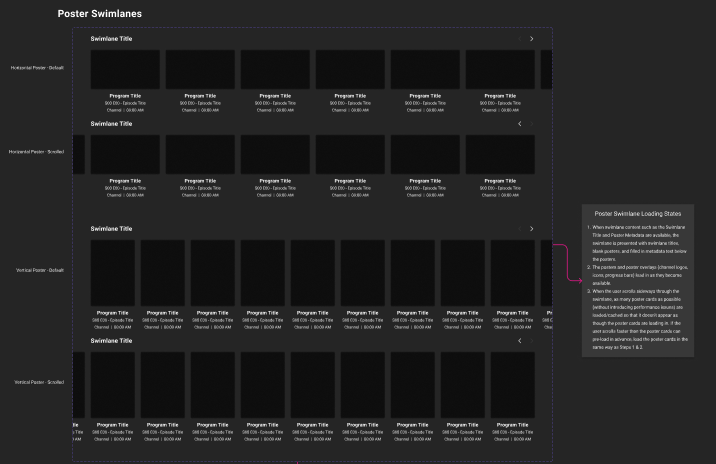
Alongside these new components, the NDVR Top Level page used existing Poster Wall components and Swimlane components.
Final Mockups
Edge case screens were documented inside of Documentation Frames, with written text explaining their behaviour.
Prototype
You may also like
