
EspialTV User Profiles
Project Overview
EspialTV is a whitelabel TV app that is rebranded by operators to provide IPTV solutions to their customers. At the time of this project, it lacked the ability to create profiles and have personalization. To tackle this goal, the UX Design team decided to implement a User Profiles feature to the structure of their app.
Duration: June 2021 - January 2022
Methods: Secondary and Market Research, Wireframing and Prototyping, User Flows, Information Architecture, Usability Testing
Type: Work Project
The Problem
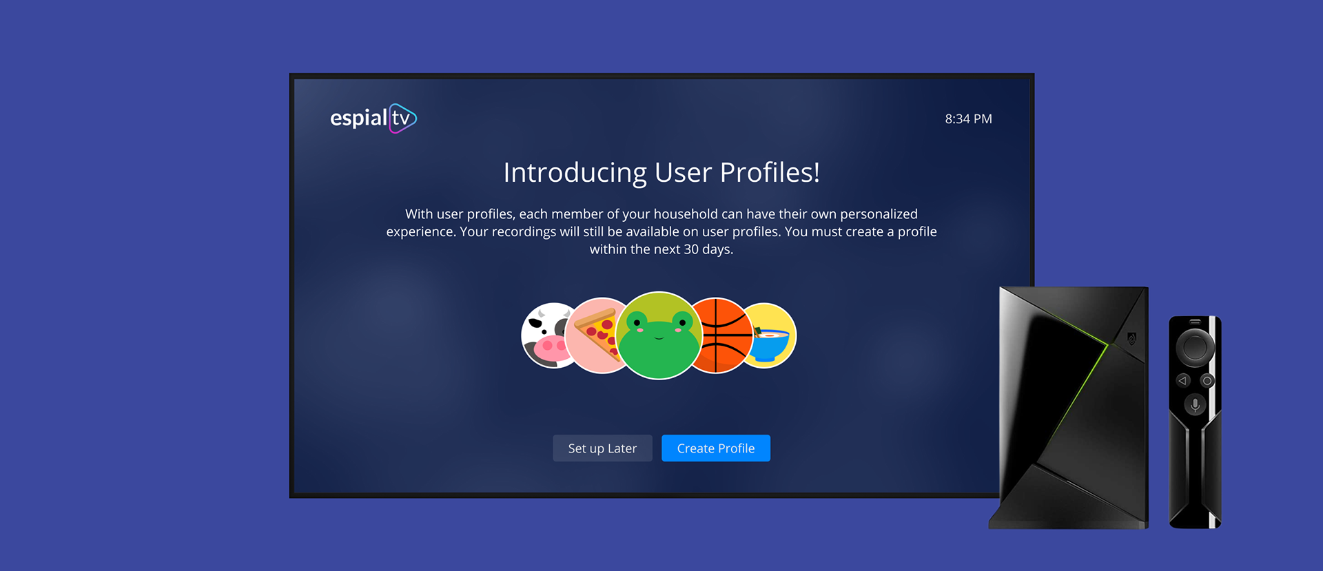
Personalization is an expected feature of most TV apps today. EspialTV previously offered minimal personalization in the form of favoriting channels and naming devices. However, market demand was pushing for more.
Streaming services have popularized segmenting viewing between users and their other family members or housemates. This feature is not as common for live TV apps, however, operator feedback had indicated that the same functionality was desired for EspialTV.
Process
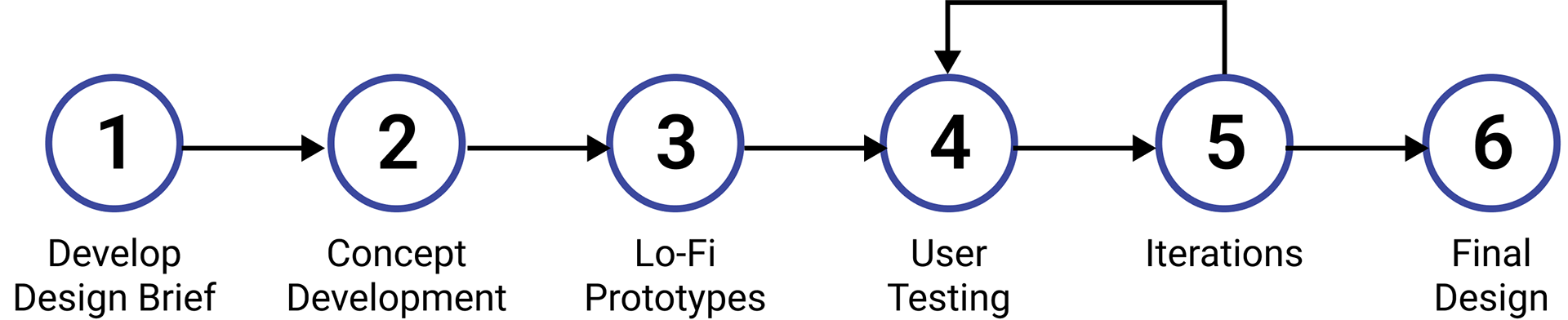
Research and Design Brief
Competitive Analysis
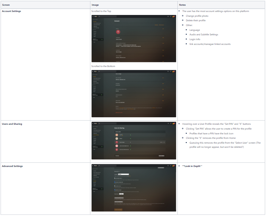
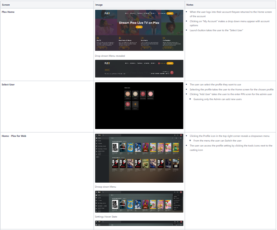
Researching user profiles on other apps unveiled many questions and helped direct our design brief. Main takeaways included:
Key User Flows
1. Profile creation - How will the user create a profile? Setting up your first profile when the feature is launched? Setting up your first profile on a new system for a new customer? Create an additional new profile?
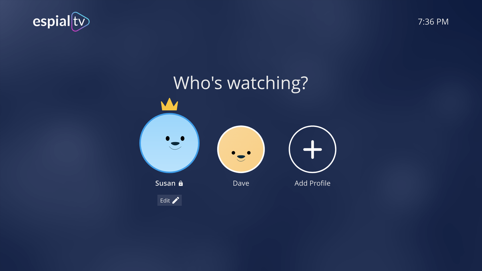
2. Profile switching - How will the user switch between the different profiles?
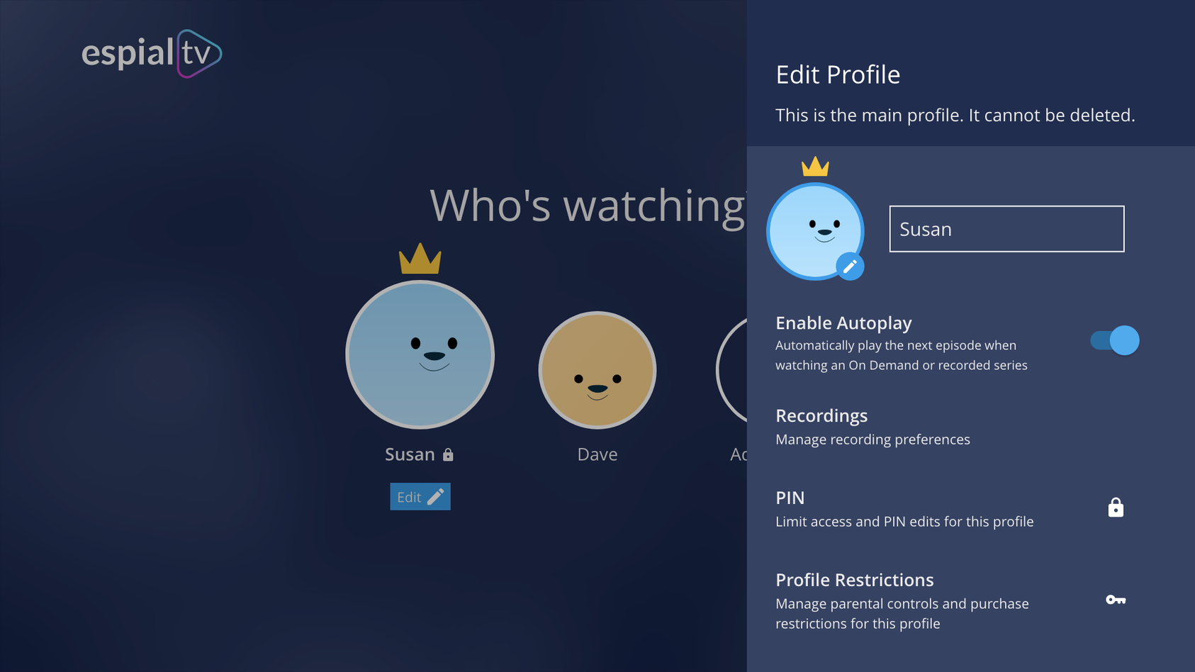
3. Profile management - How can the user manage multiple profiles?
Design Requirements & Features
1. Primary vs secondary profiles
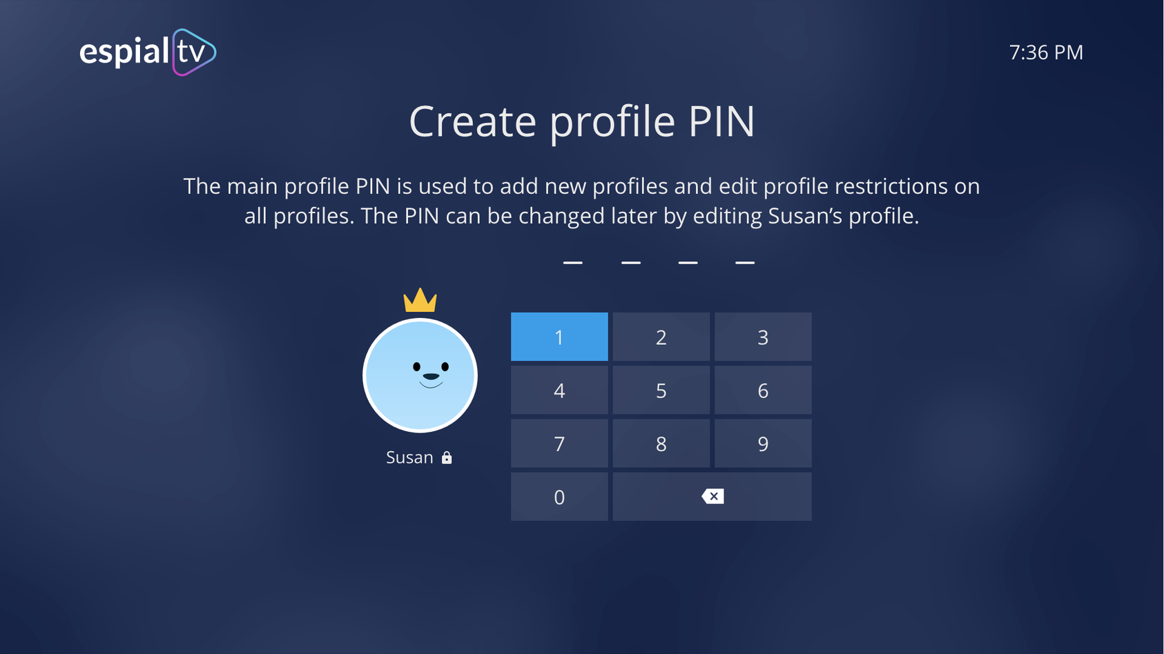
2. Mandatory vs non-mandatory parts of profile creation
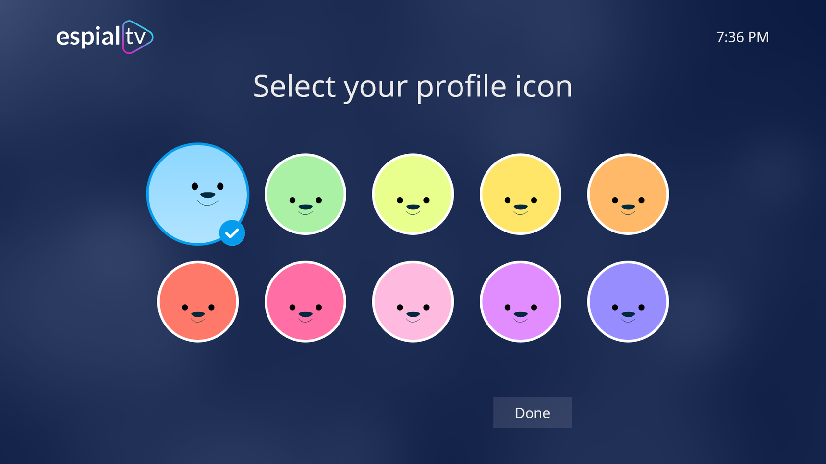
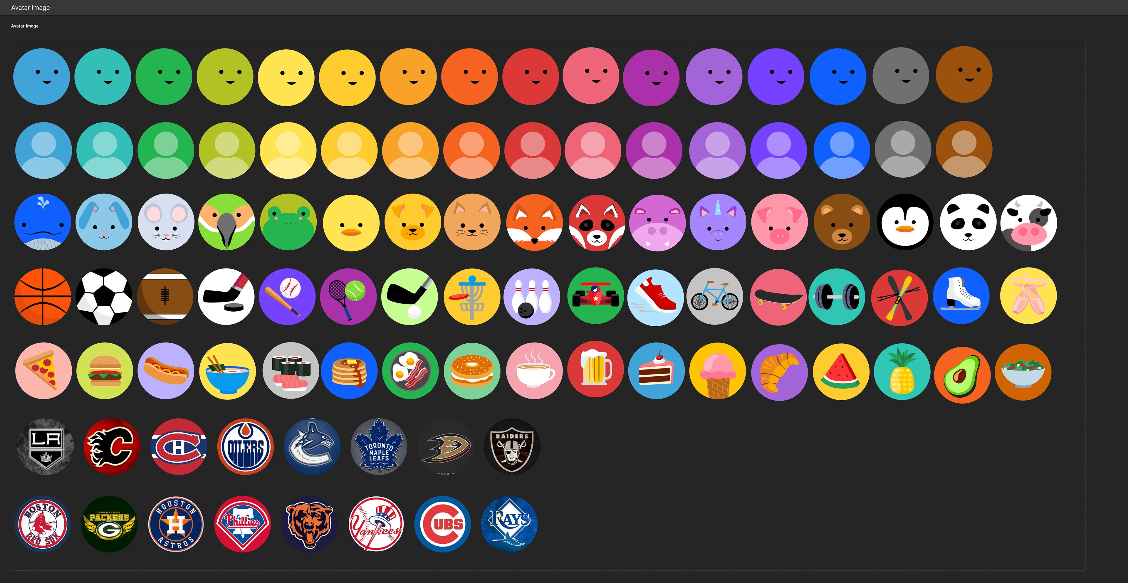
3. Option to choose avatars and personalize
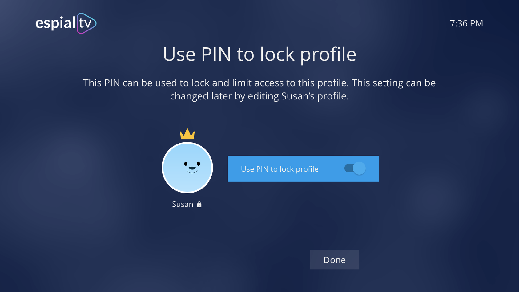
4. More profile settings and options available when user decides to edit the profile
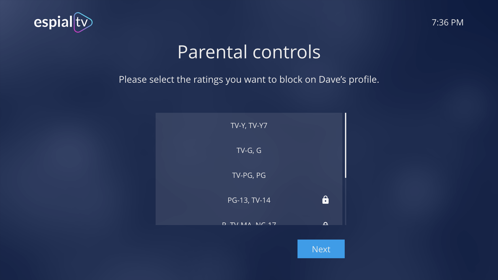
5. Parental controls
Ideation and Initial Development
User Flows
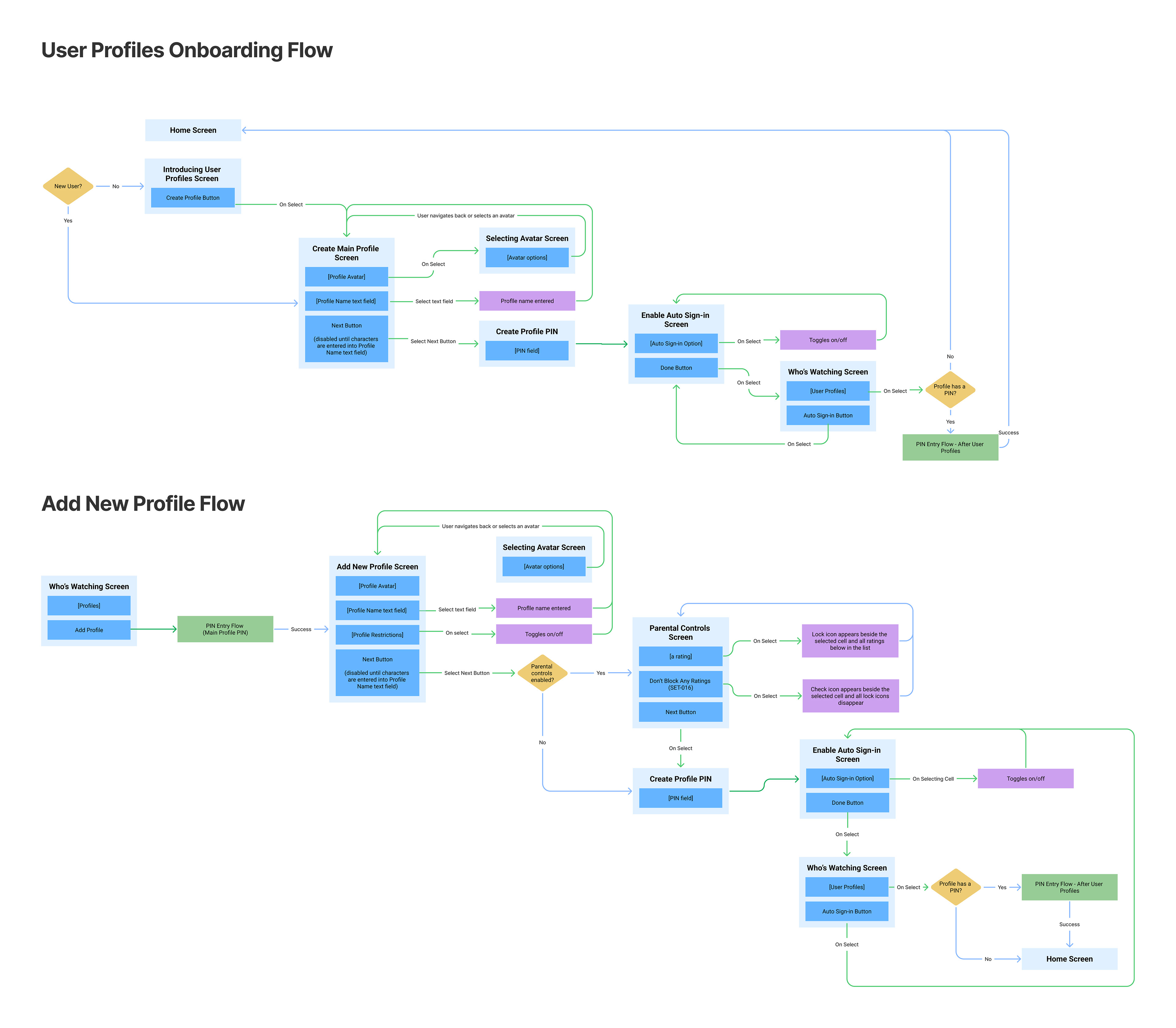
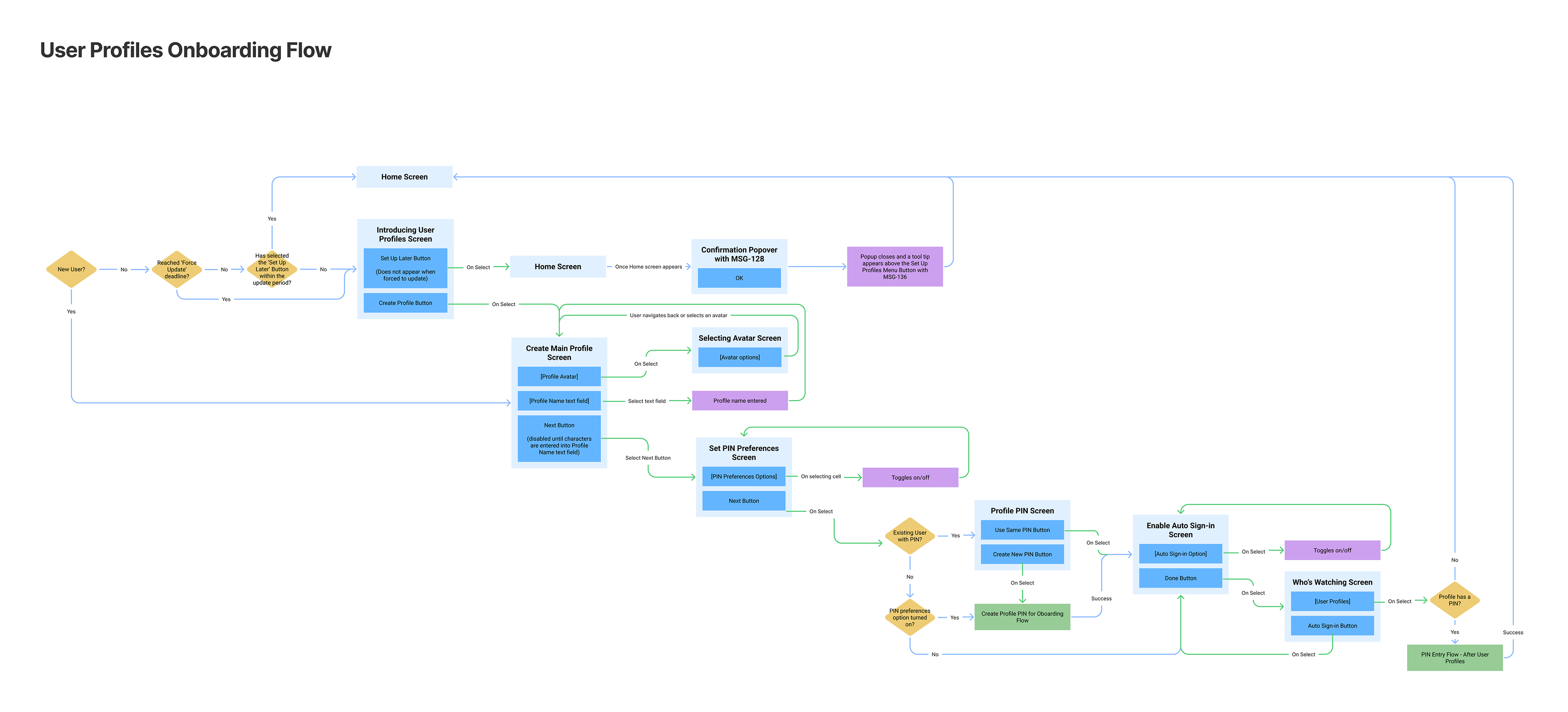
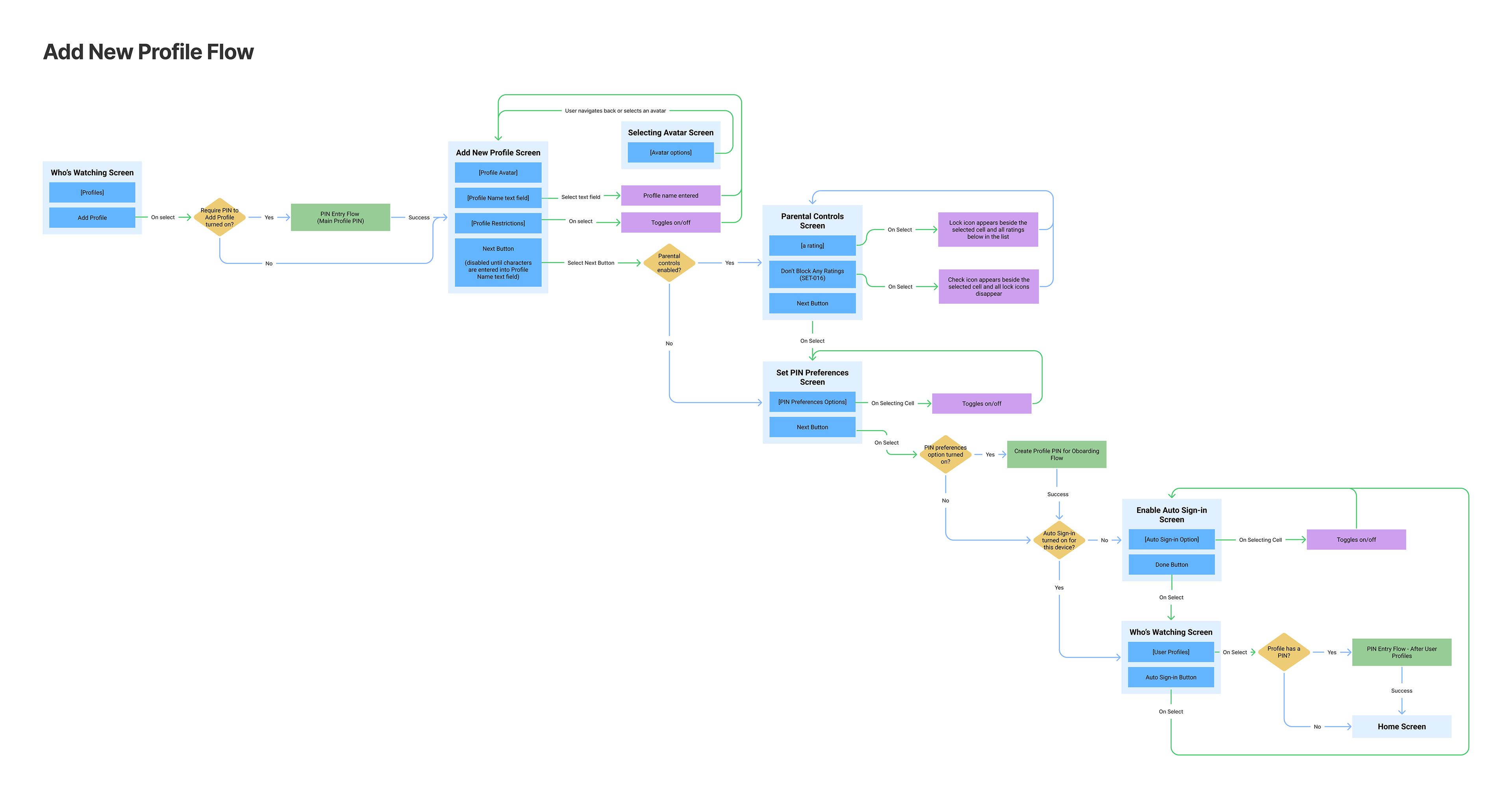
First, the team created user flows on Figjam for the two profile creation flows, one for onboarding, and one for adding a secondary profile.
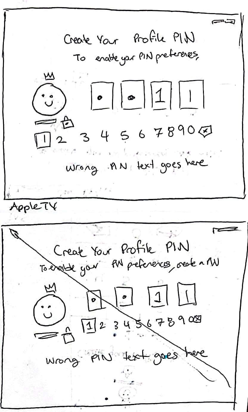
As a team, initial ideation was completed in a two-day design sprint. For every screen, each member of the team would sketch designs, then discuss and vote on ideas.
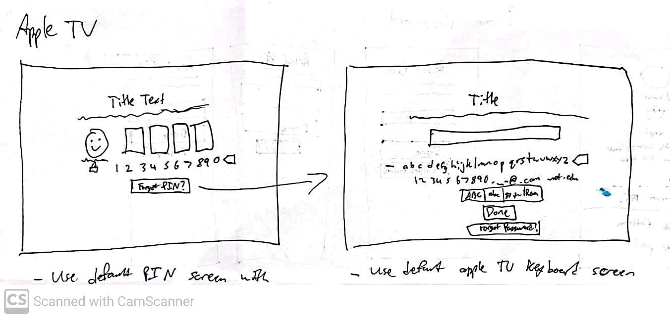
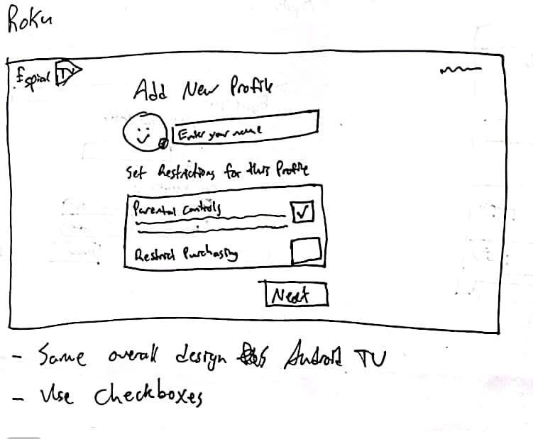
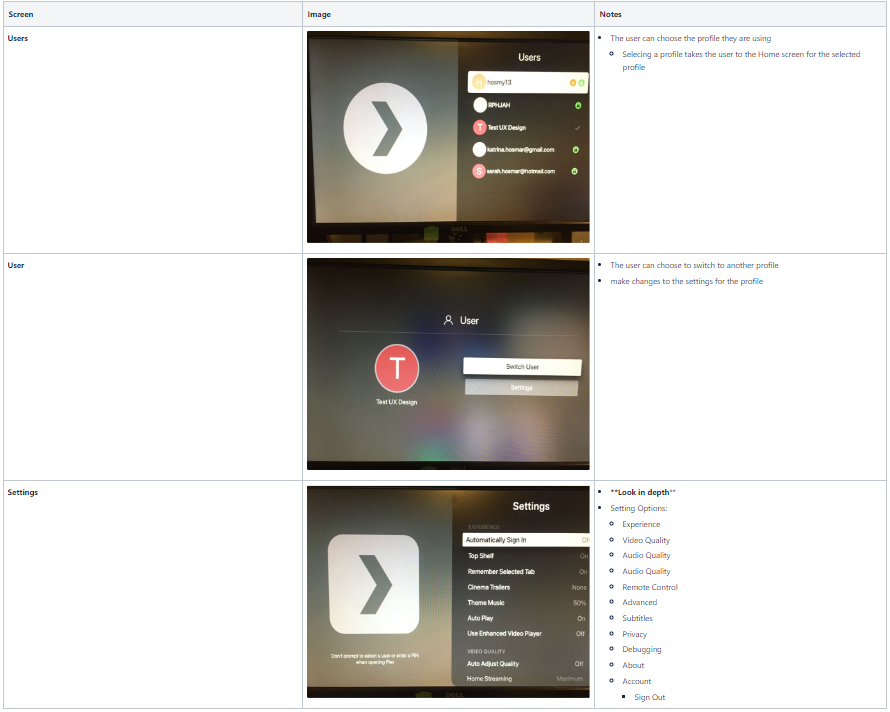
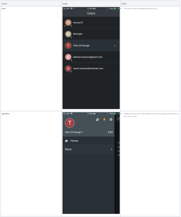
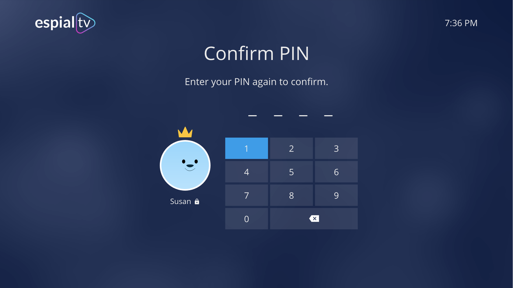
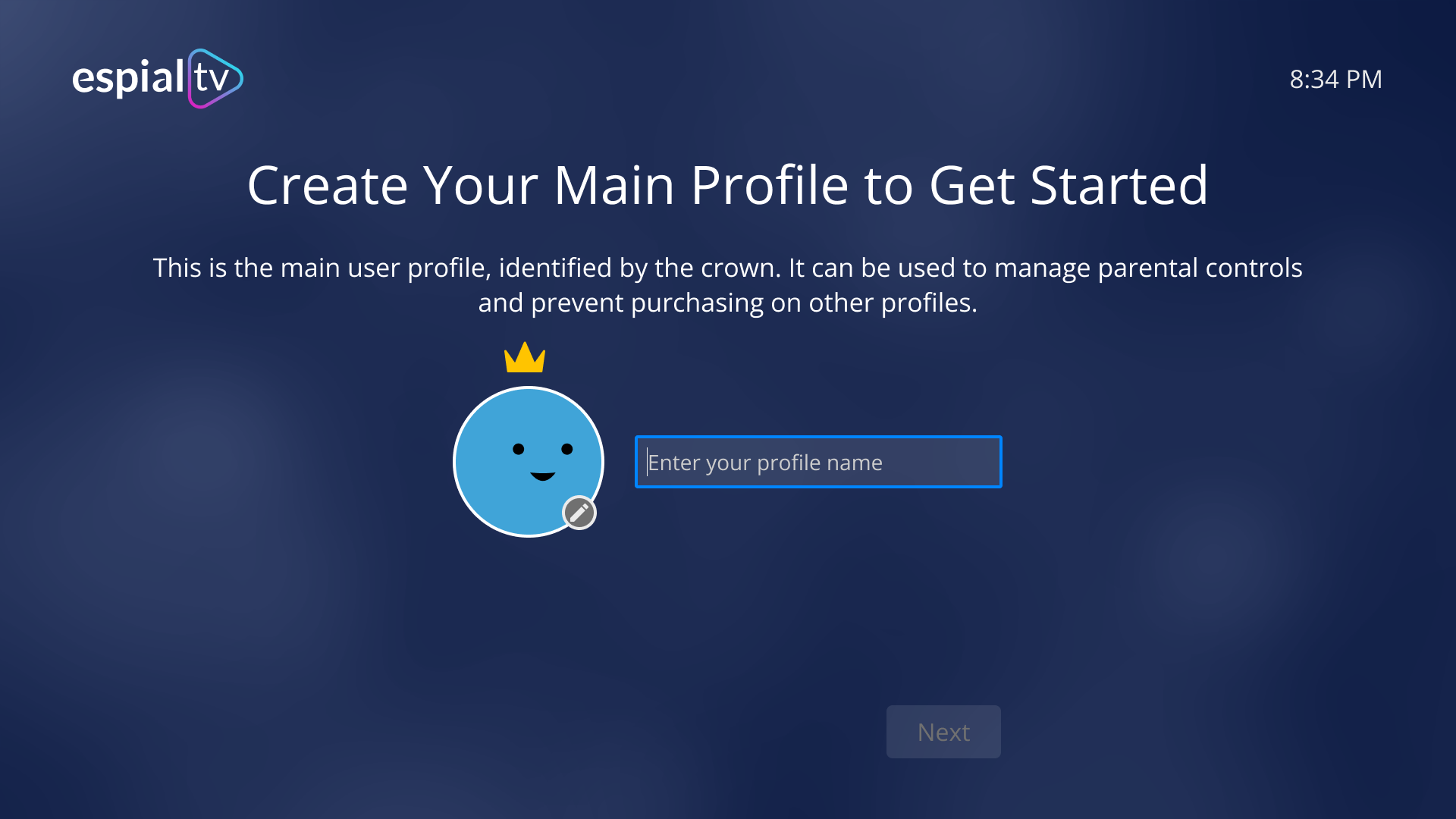
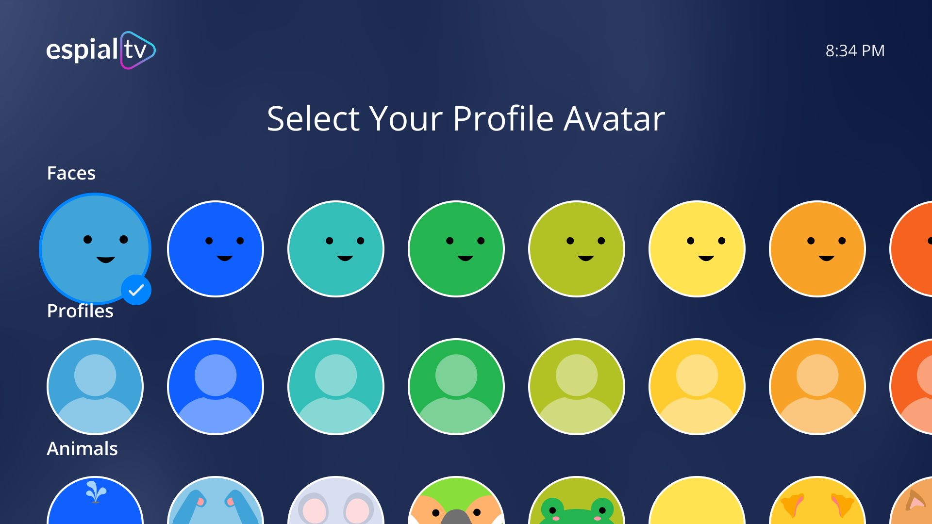
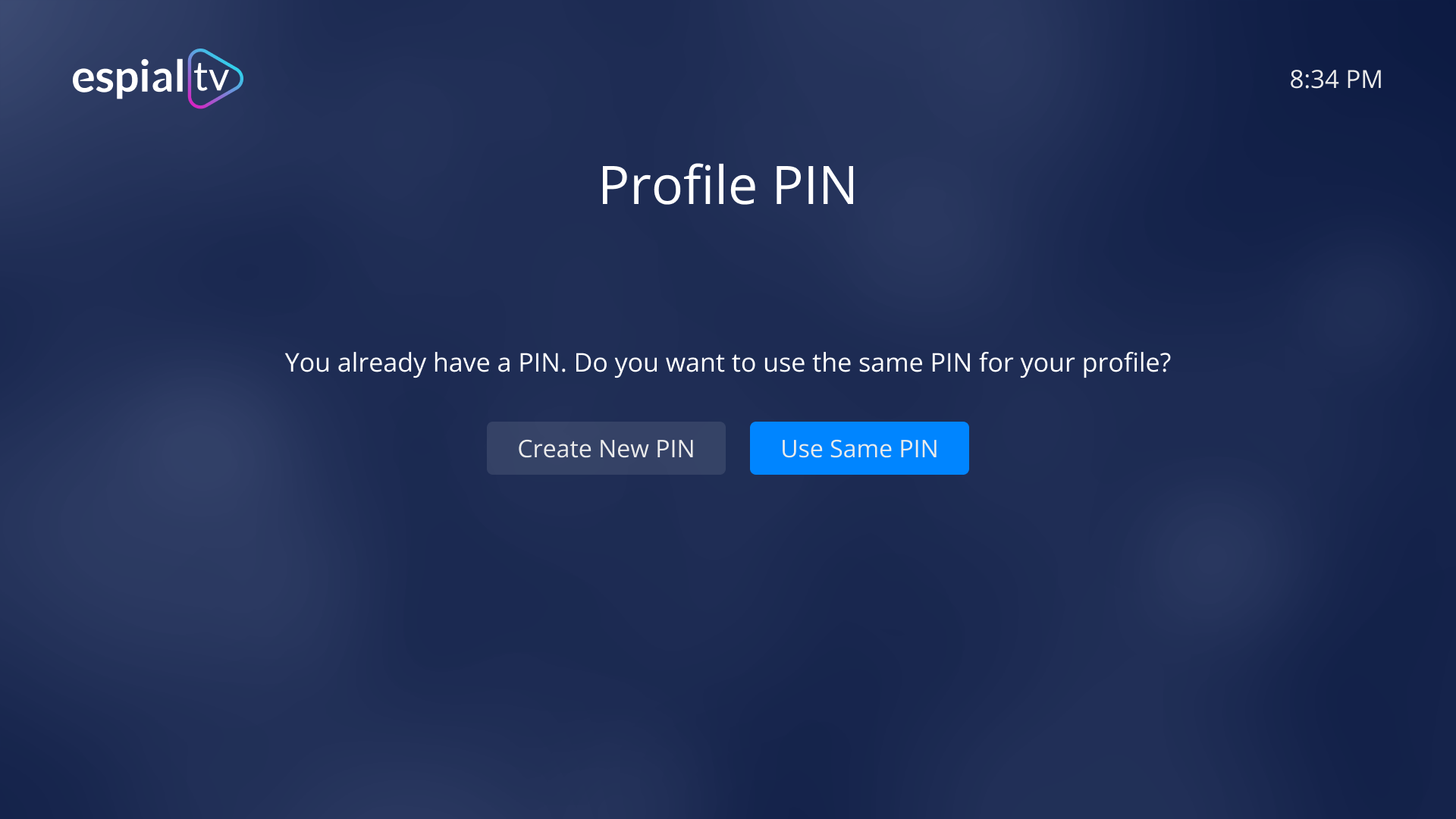
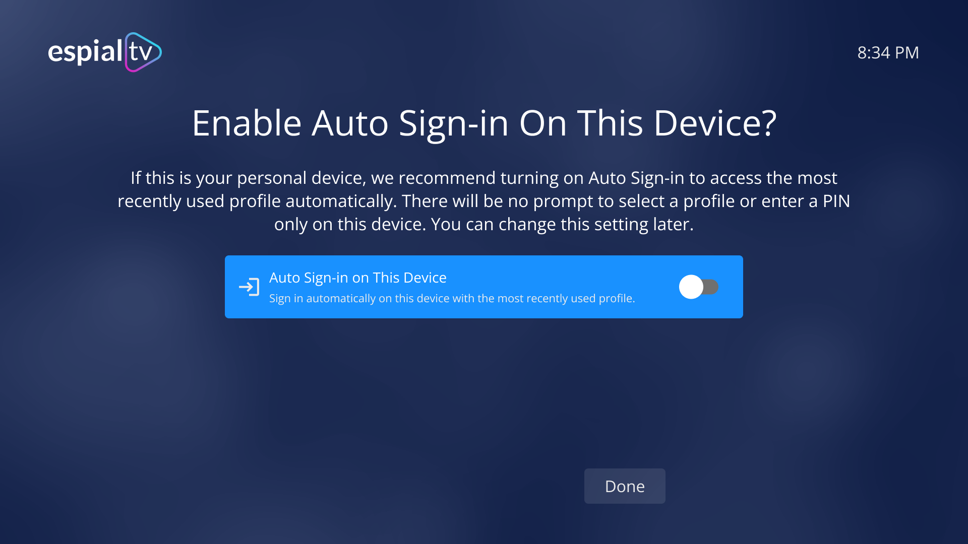
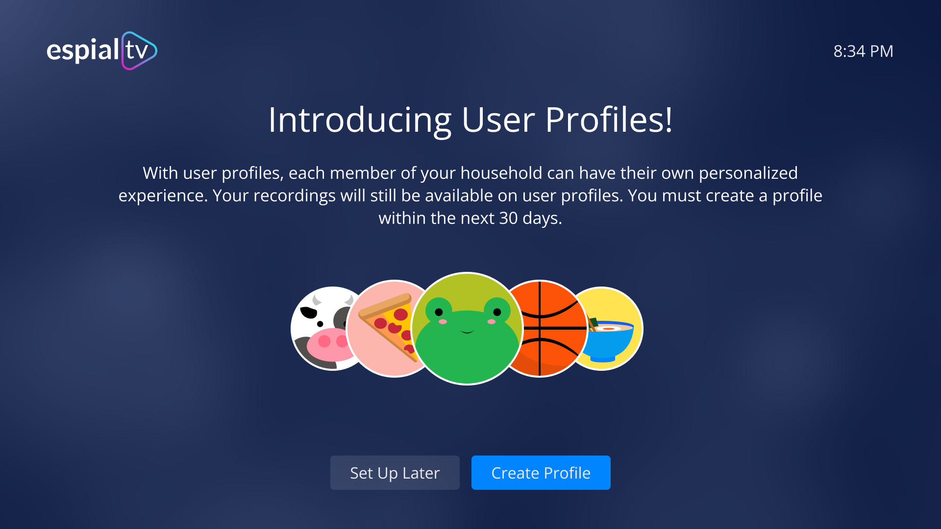
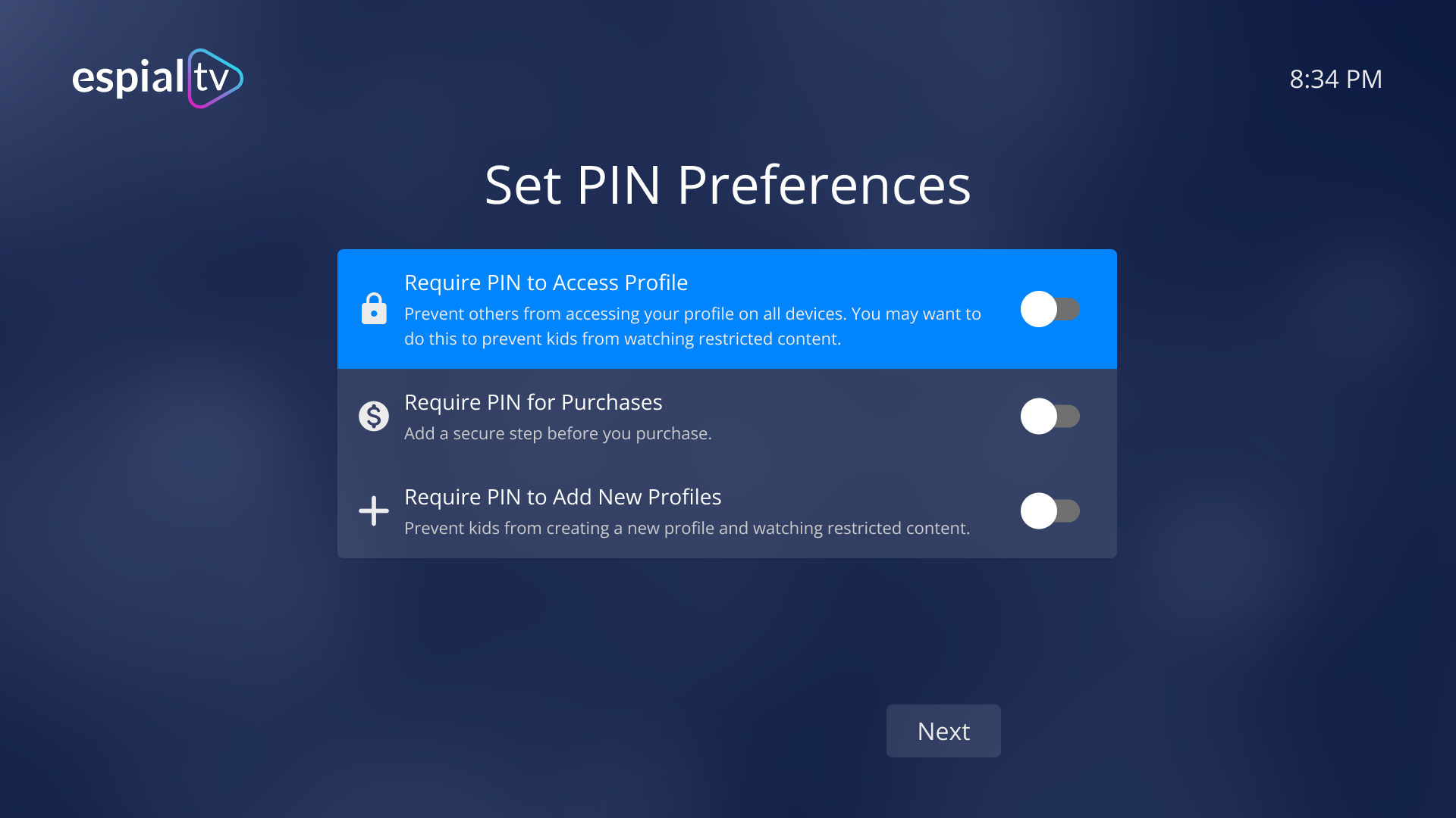
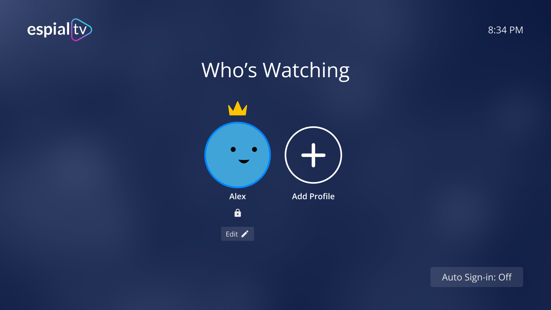
From here, mockups were done in Figma for each of the screens. Shown below are the screens making up the onboarding flow.
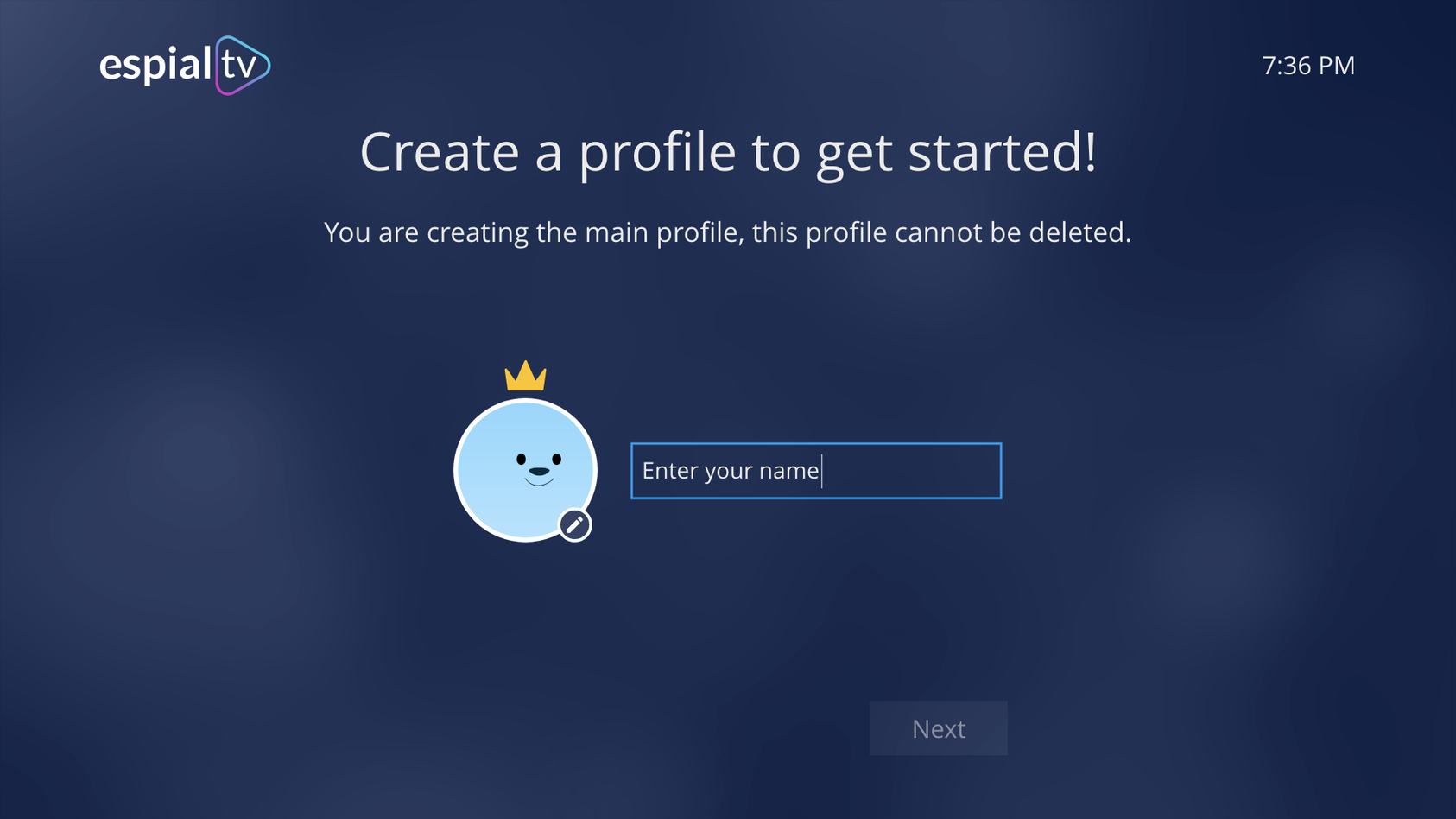
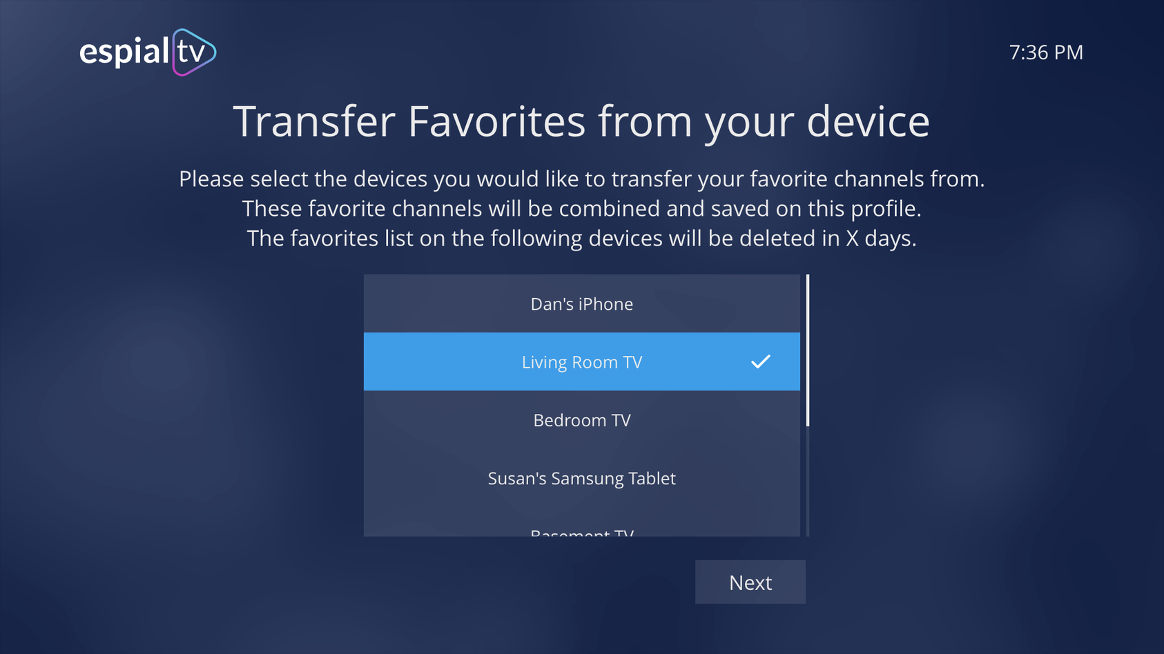
A prototype was generated using these screens in order to conduct usability testing.
Usability Testing
Once the initial prototype was complete, we conducted our first round of usability testing to understand the obstacles that users encountered leading up to the point of user profile feature adoption.
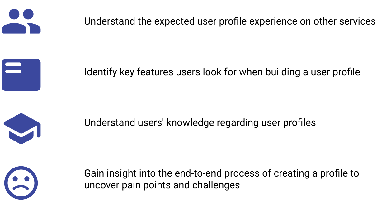
Testing Goals
Success Metrics
1. Expectation Match - Ask what the next screen would be and after they move to next screen, ask if that makes sense.
2. User Opinion Rating - Ask them to rate their level of agreement with statements related to user profiles
Research Method
To conduct the testing, we hosted remote 1-on-1 sessions, each 60 minutes long. Each session had a facilitator and note-taker.
We divided our recruitment into two different types of users. User group 1 was existing users, those who were familiar with our current app. Group 2 were new users, who have not used our app but may use other streaming services.
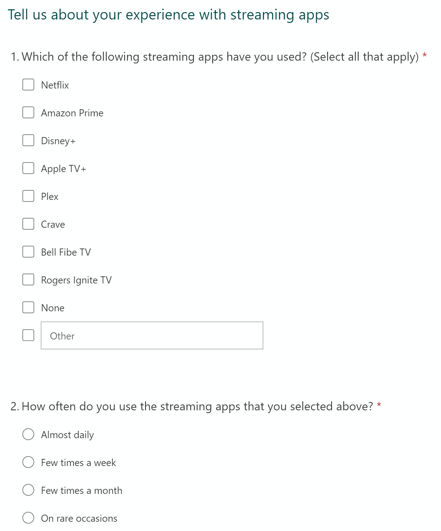
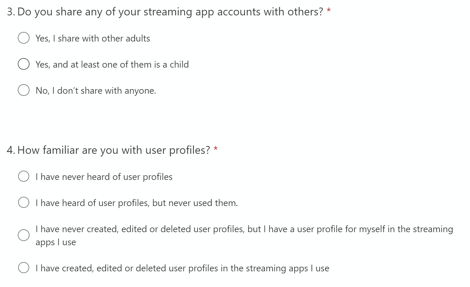
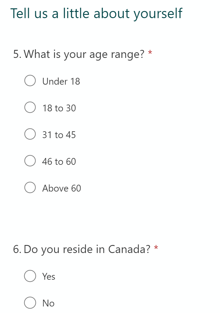
Recruitment Critieria
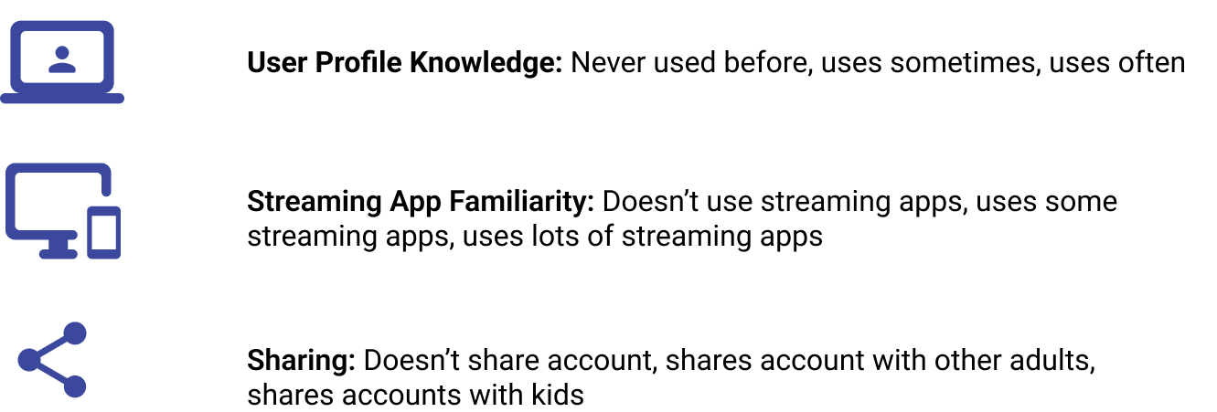
Recruitment Survey
Analysis & Insights
The results of our usability testing highlighted many pain-points and opportunities for improvement in the prototype. Using data coding methods, we grouped together common feedback and then created problem statements for each step of the user flow.
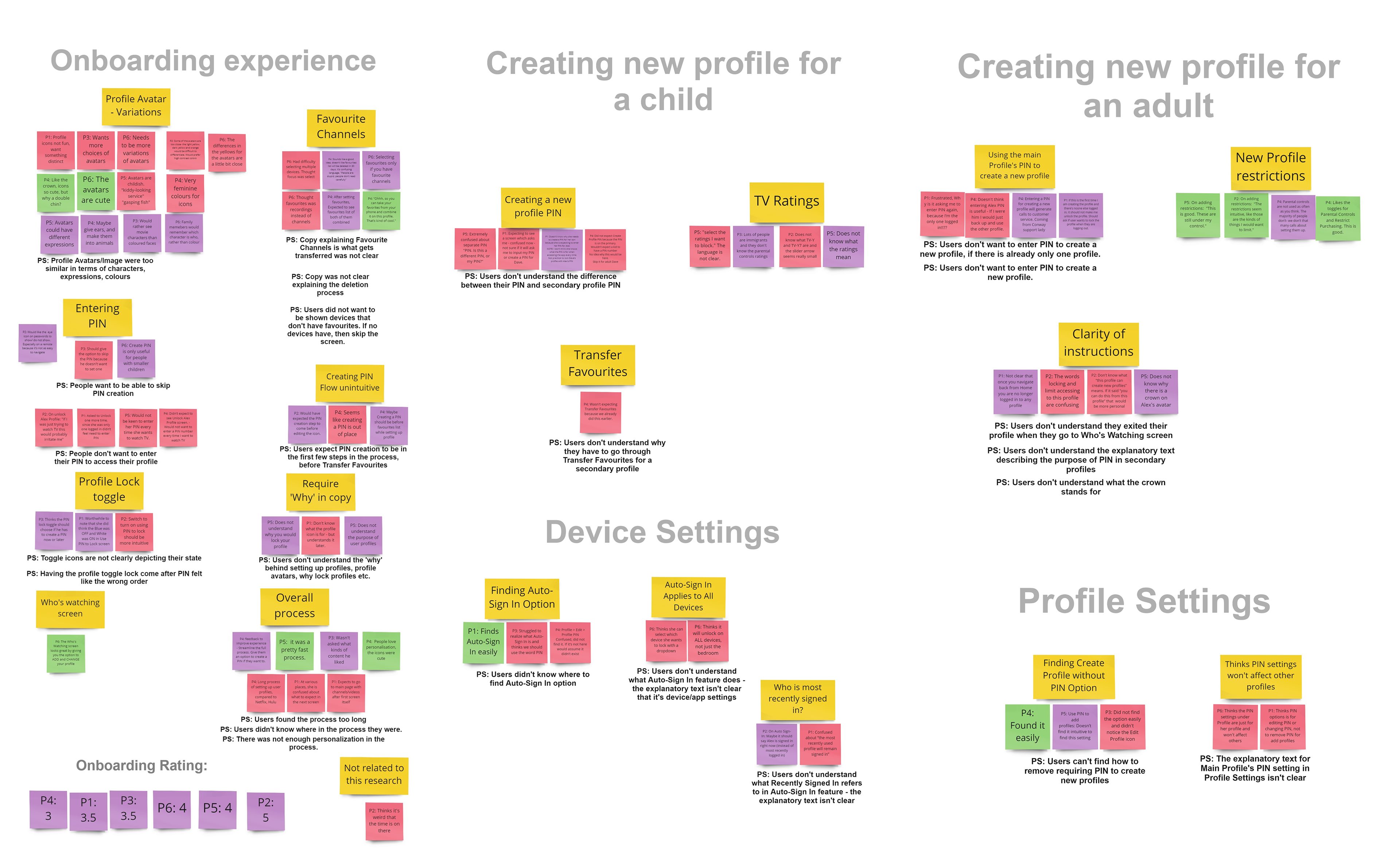
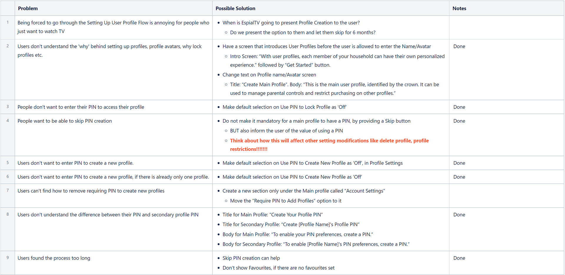
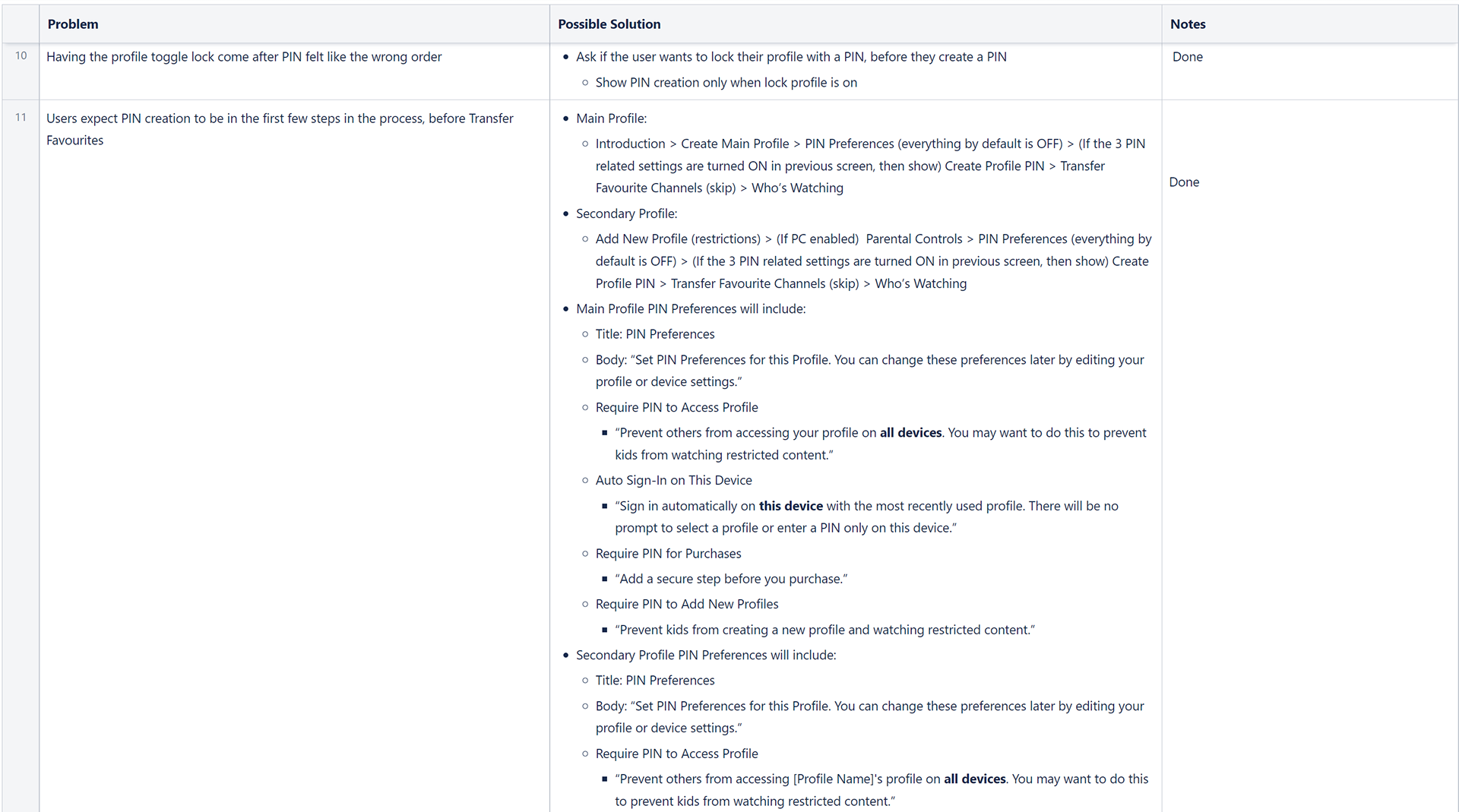
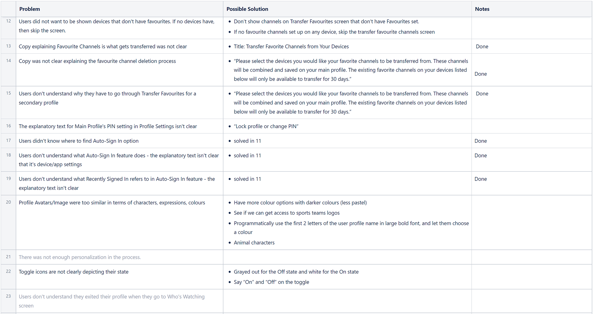
We then addressed each of our problem statements as a team, listing action items to improve the user flow. In total, we had identified 27 problem statements from our first iteration of the flow.
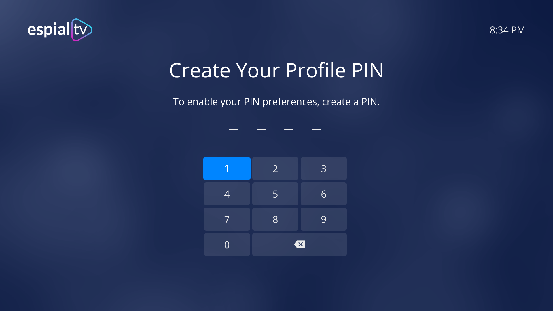
Our key takeaways was that the flow was too long, and that users did not want PIN creation to be mandatory.
Additional feedback included wanting more variety for the avatars, and that transferring favorites was confusing.
Iterating the Design
Usability testing told us that we had to change the onboarding flow. We restructured the functionality so that PIN creation was no longer mandatory, and removed transferring favorites.
While this added complexity to the various onboarding scenarios, it shortened the overall flow, allowing those who wanted to complete it quickly in under a minute.
New Flows After Testing
Additional changes included offering a larger variety of profile avatars. I completed the graphic design for over 40 internal avatar options. We also explored possibilities of including sports logos and other logos.
Screen Iterations
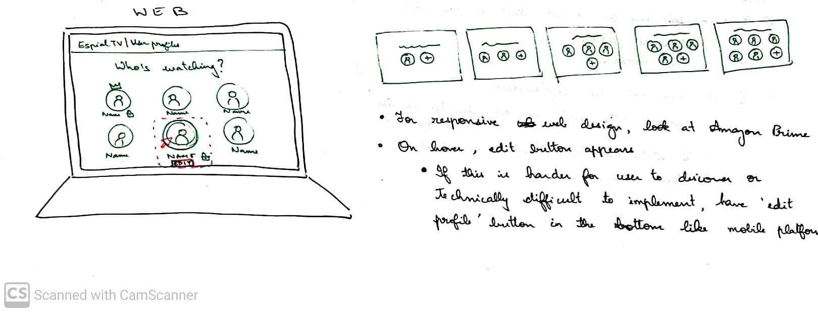
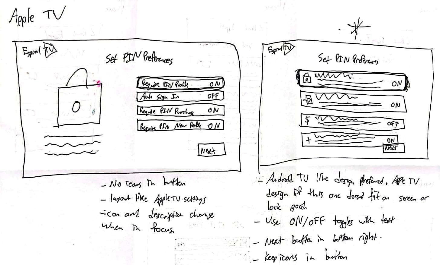
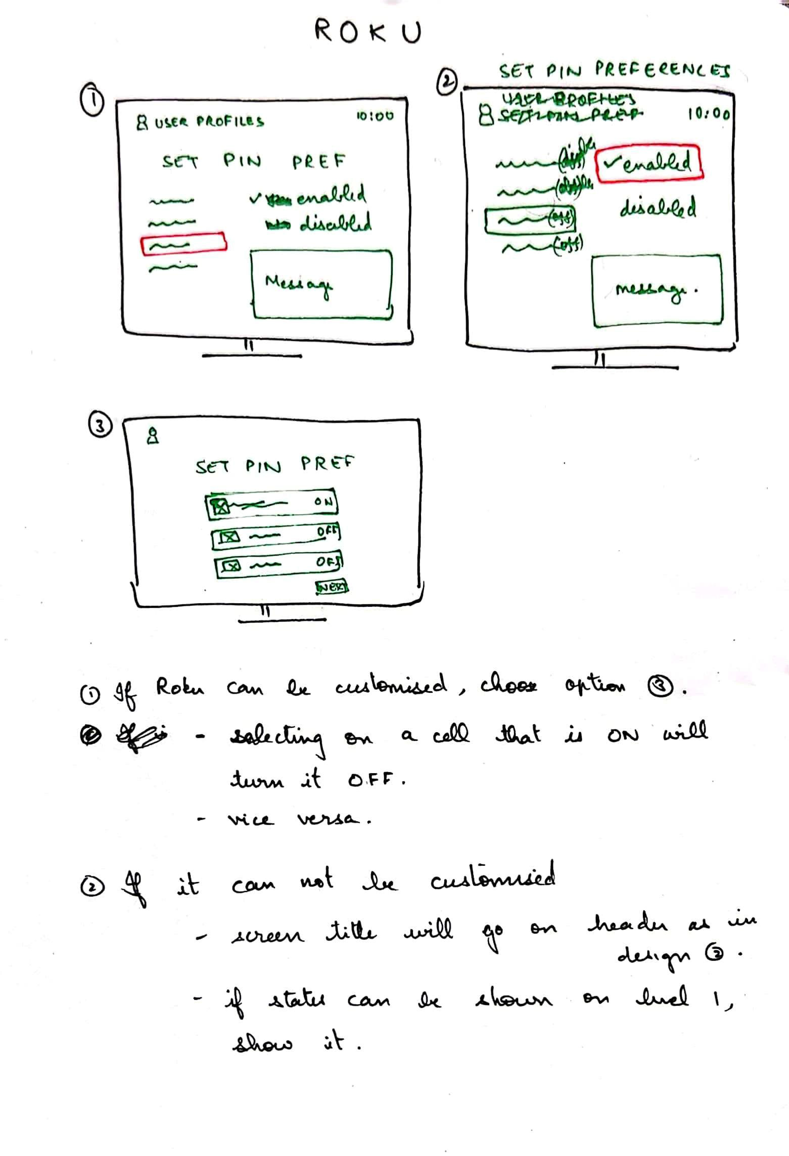
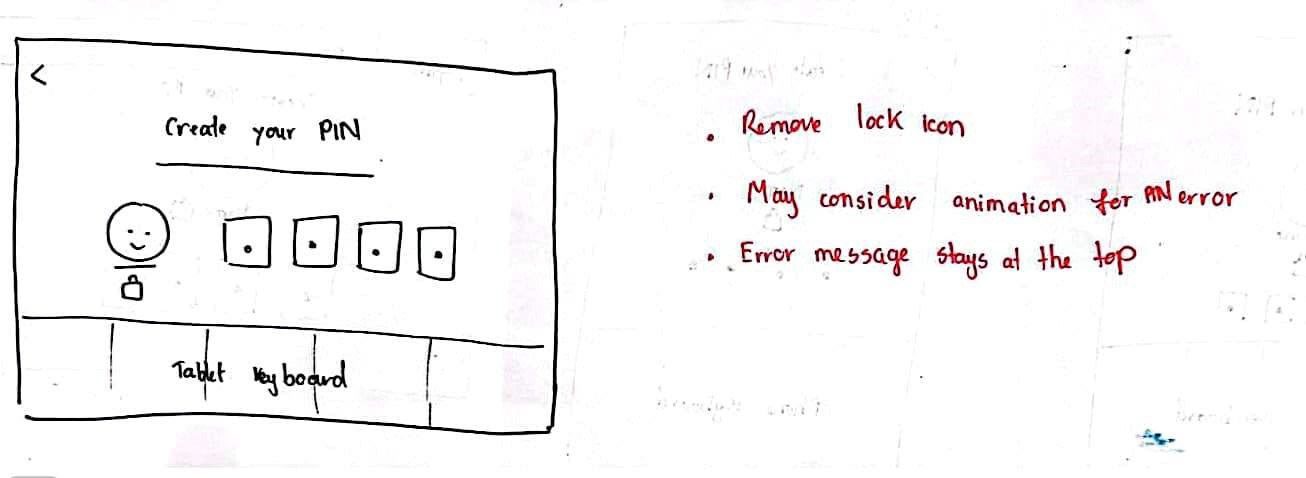
Based on the changes made to the flows, we had to both add new screens and iterate on existing screens. This included copy changes, layout adjustments, and changes in graphics/icons.
Usability Testing Round 2
A second prototype, created from our new flow and screens, was used to conduct another round of usability testing. We employed the same research method with 6 different participants.
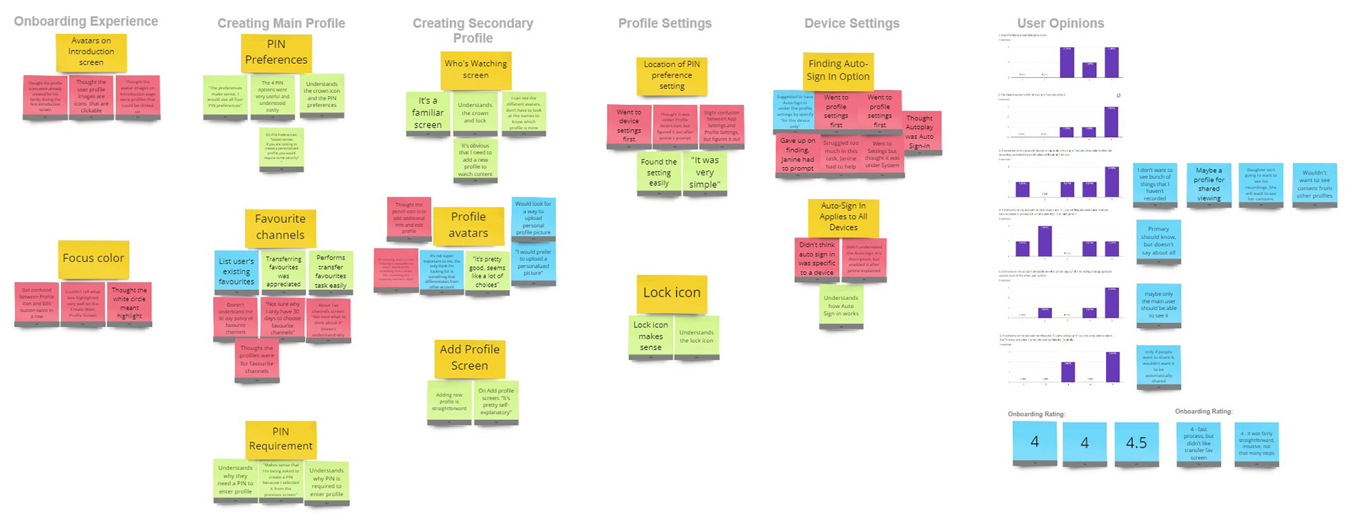
Our analysis revealed only 7 problem statements, a significant decrease from the 27 statements from our first round of testing. We were very pleased with this result, and it gave our stakeholders much more confidence in our design direction.
We used the remaining statement to create action items in order to work towards our final design.
Final Design
You may also like

