
EspialTV App Redesign
Project Overview
EspialTV is a whitelabel TV app that is rebranded by operators to provide IPTV solutions to their customers. The goal of this redesign was to update the AndroidTV app to be more useful and intuitive to users. To tackle this goal, both the Details and Episode List screens, which had not been modernized since 2016, were refreshed and updated.
Duration: June 2022 - August 2022
Methods: Secondary and Market Research, Wireframing and Prototyping, Usability Testing
Type: Work Project
The Problem
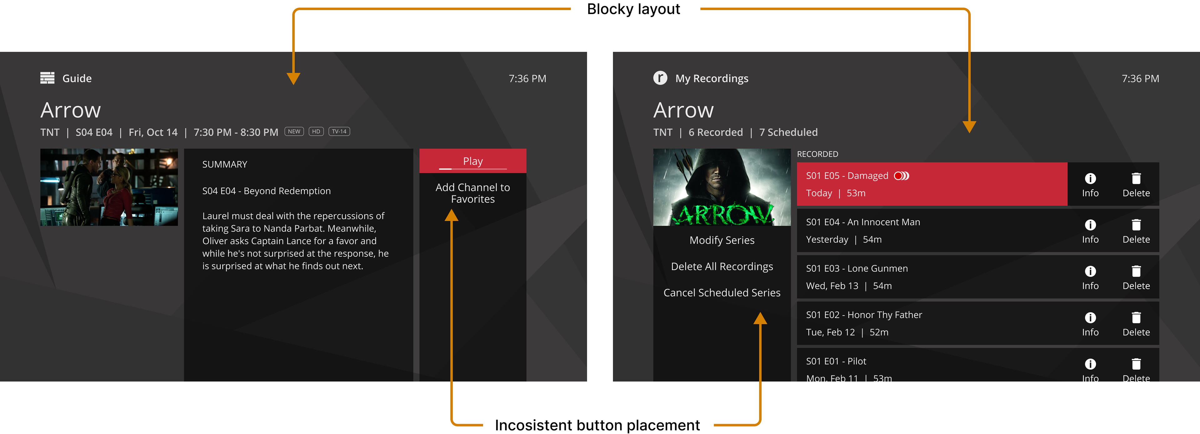
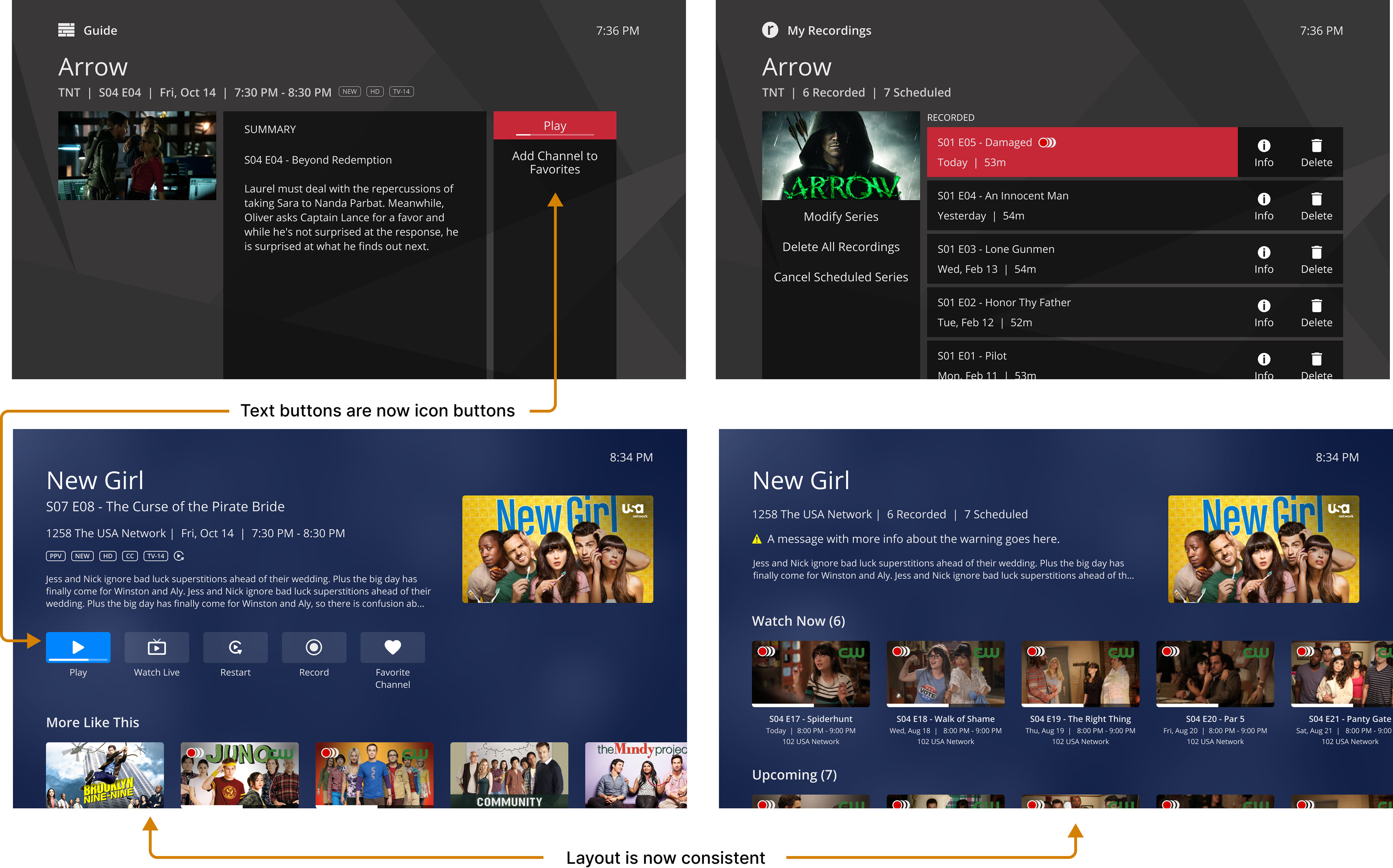
Both the Details and Episode List screens suffered from usability issues. The layouts were blocky and difficult to navigate. Apart from the poster, there were no other graphical icons or swimlanes to make the screens appear more interesting. There was also a lack of consistency between the Details and Episode list screens. For example, the buttons were on the right side of the Details screen but on the left side of the Episode List. This was creating confusion for users navigating from screen to screen.

Process
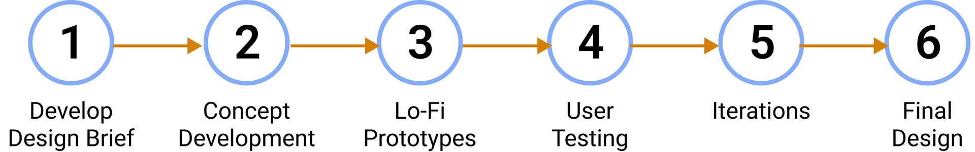
Design Brief
When approaching this redesign, there were several things to keep in mind, as the app already existed across multiple platforms aside from Android TV, including AppleTV, Roku, iOS mobile, and Android mobile.
Goals & Objectives

Concept Development
Before starting mockup ideation, comparisons were done between the current Android TV design and other platforms.
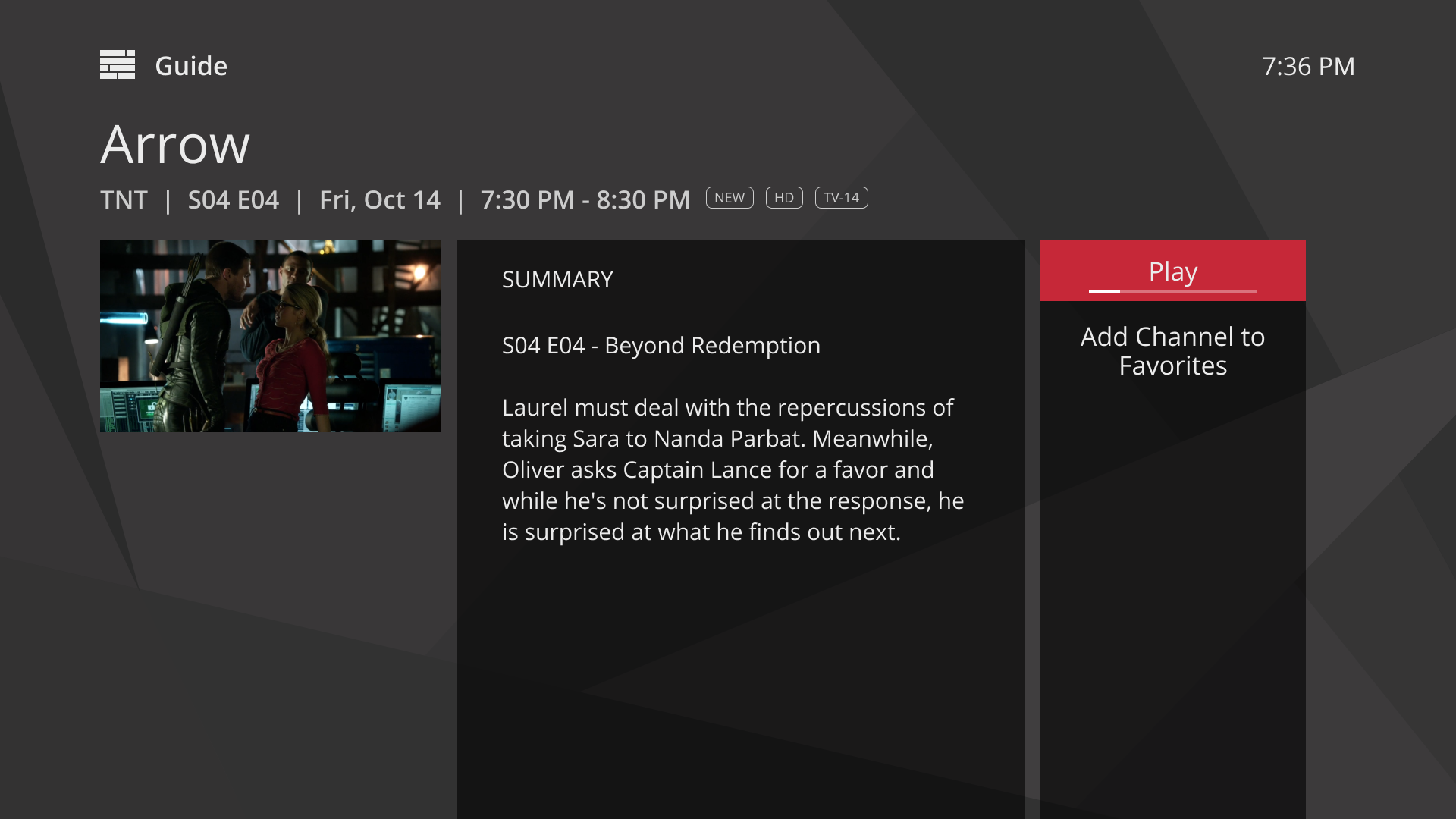
Current EspialTV Android TV Designs
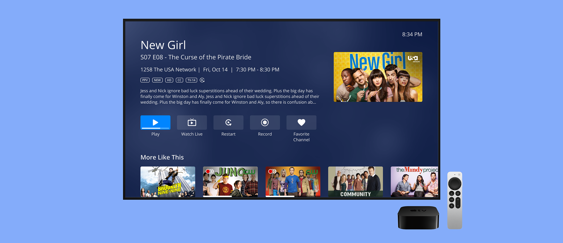
EspialTV Apple TV Designs
Ideation & Initial Development
To kickstart the ideation phase, the design team completed an hour-long sprint sketching ideas for the new screens. We then voted on the best designs to move forward.
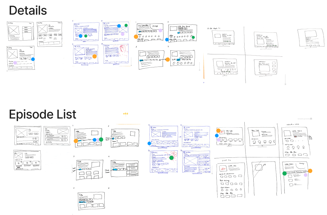
As the design lead on this project, I began exploring low fidelity mockups in Figma.
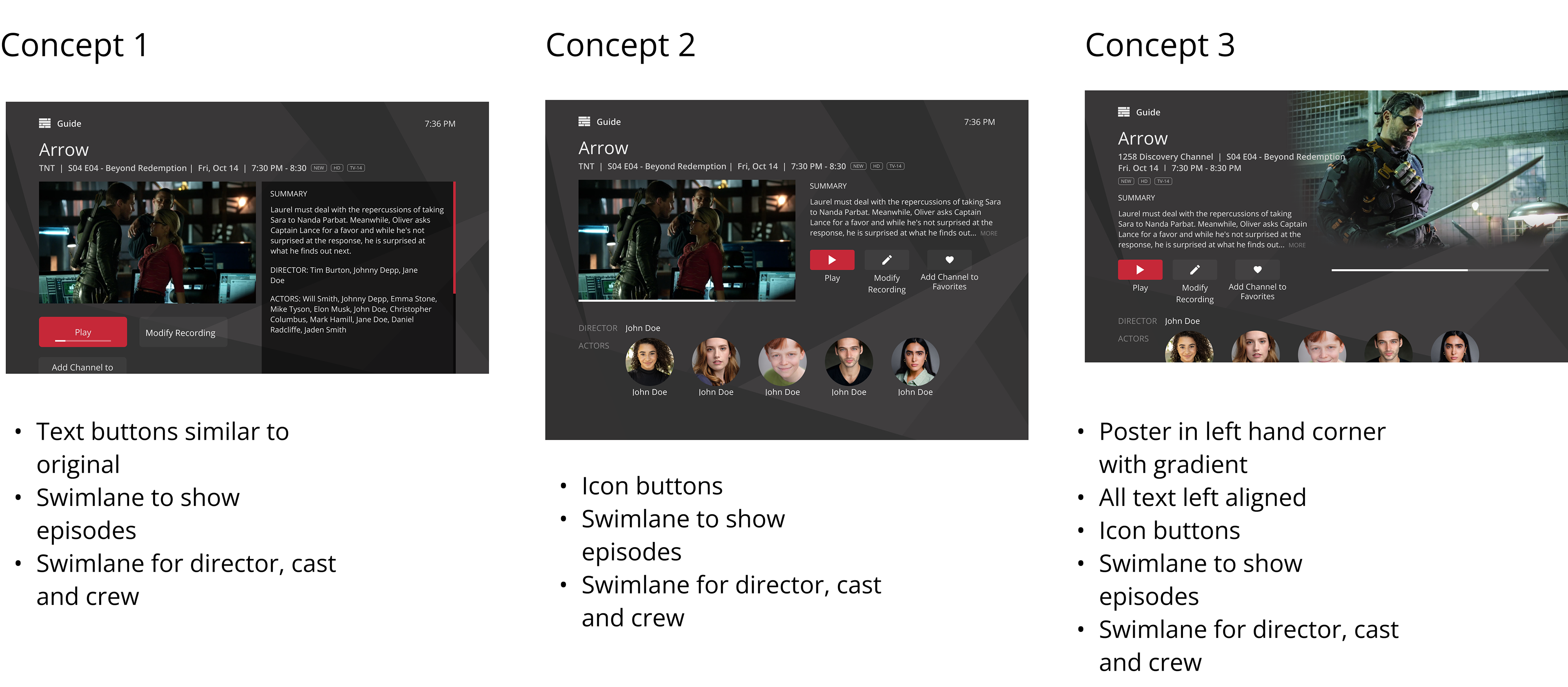
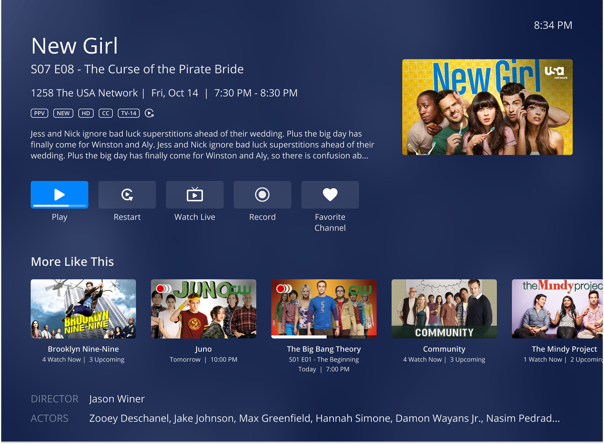
From here, further iterations were done with adjustments including a smaller poster, consistent left-aligned text, and buttons similar to those on AppleTV.
Refining the Design
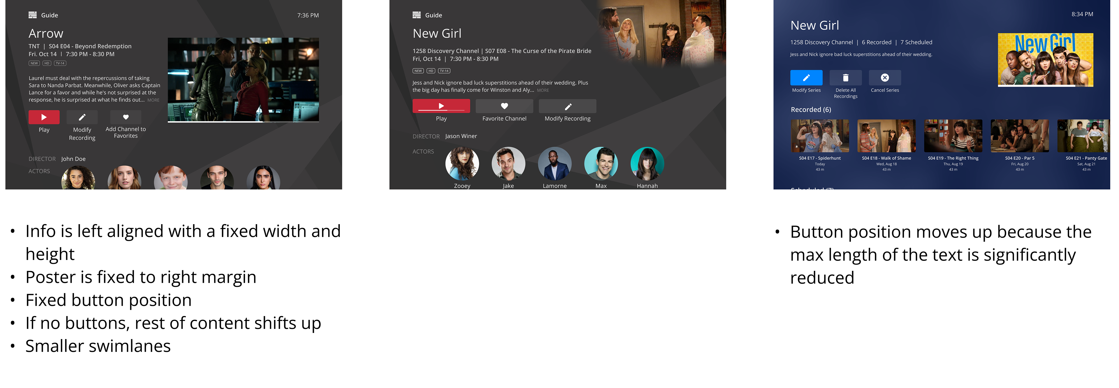
The layout was further streamlined from the concept iterations. Notably, it was also decided that this screen should function as a template, with all program info in a fixed text box, and the buttons and poster in a fixed position.
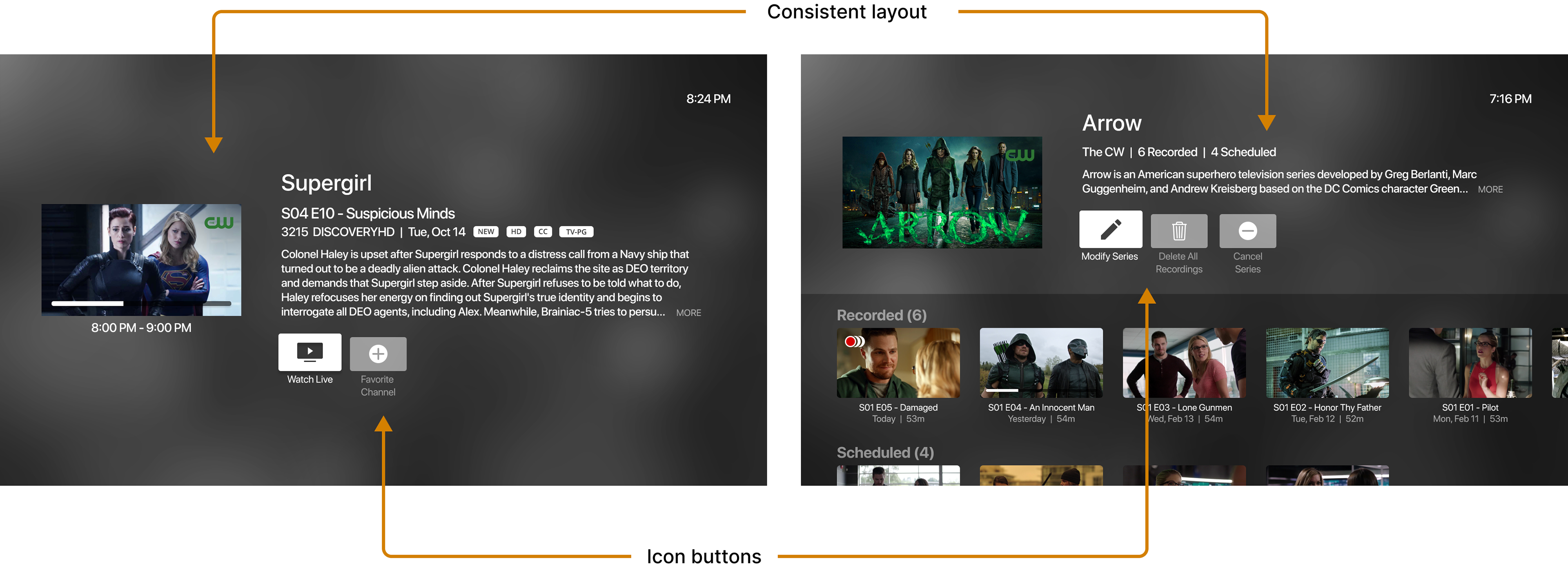
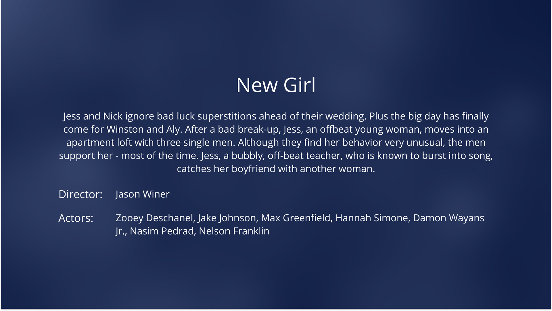
New Design Features
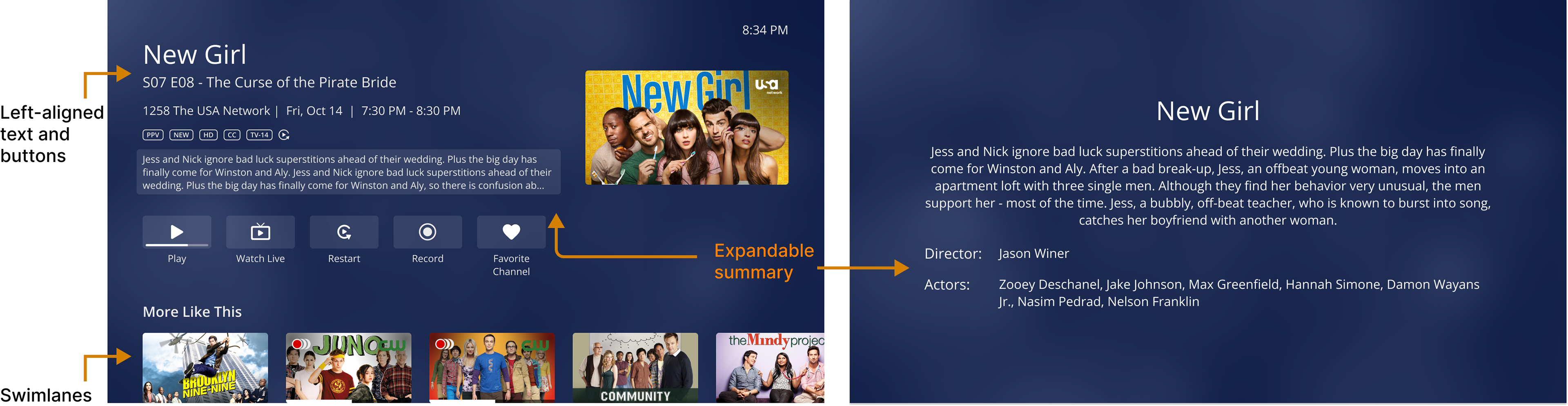
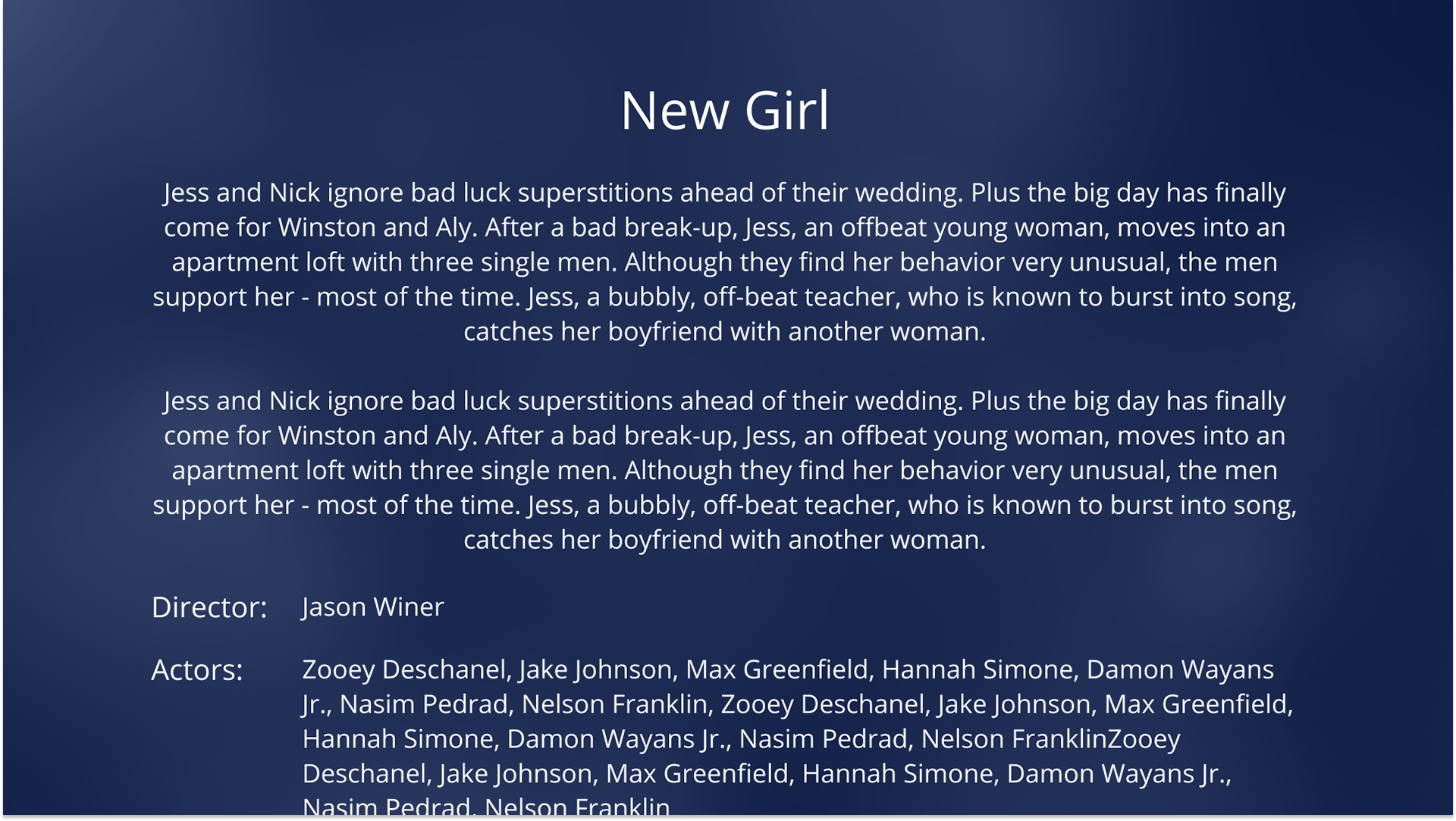
The Episode List Screen was designed to have an identical layout to the details screen, the only difference being an adjusted fixed position of the buttons. The buttons were been remade into icon buttons instead of just text, similar to AppleTV.
Old vs. New Design Comparison
Usability Testing
Four rounds of usability testing were conducted, A/B testing the current designs with the new proposed designs.
At this point, the design of the new screens had already received feedback internally, and the usability test aimed to receive feedback from end users to determine if the new designs actually provided a better experience. The sessions were conducted remotely, 1-on-1 with each participant, and were 60 minutes long with one facilitator and one notetaker.
The notes were then consolidated and analyzed on Figjam, using sticky notes to denote successes, pain points, and opportunities.
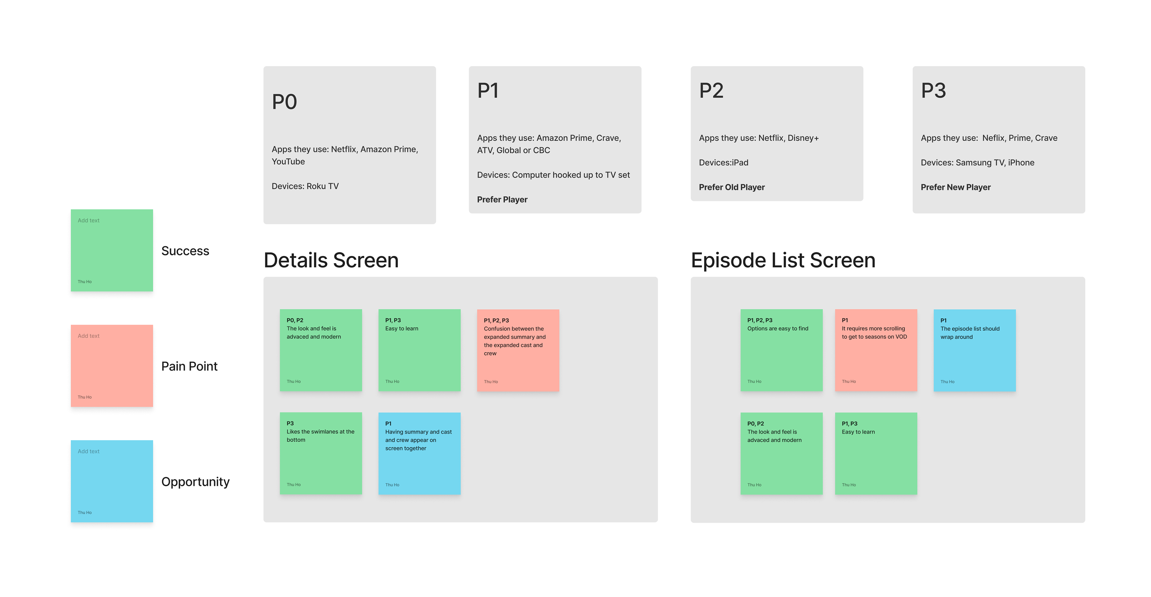
Adjustments to the design were completed based on feedback, including adjusting the expandable summary screen and refining the season picker interaction on VOD.
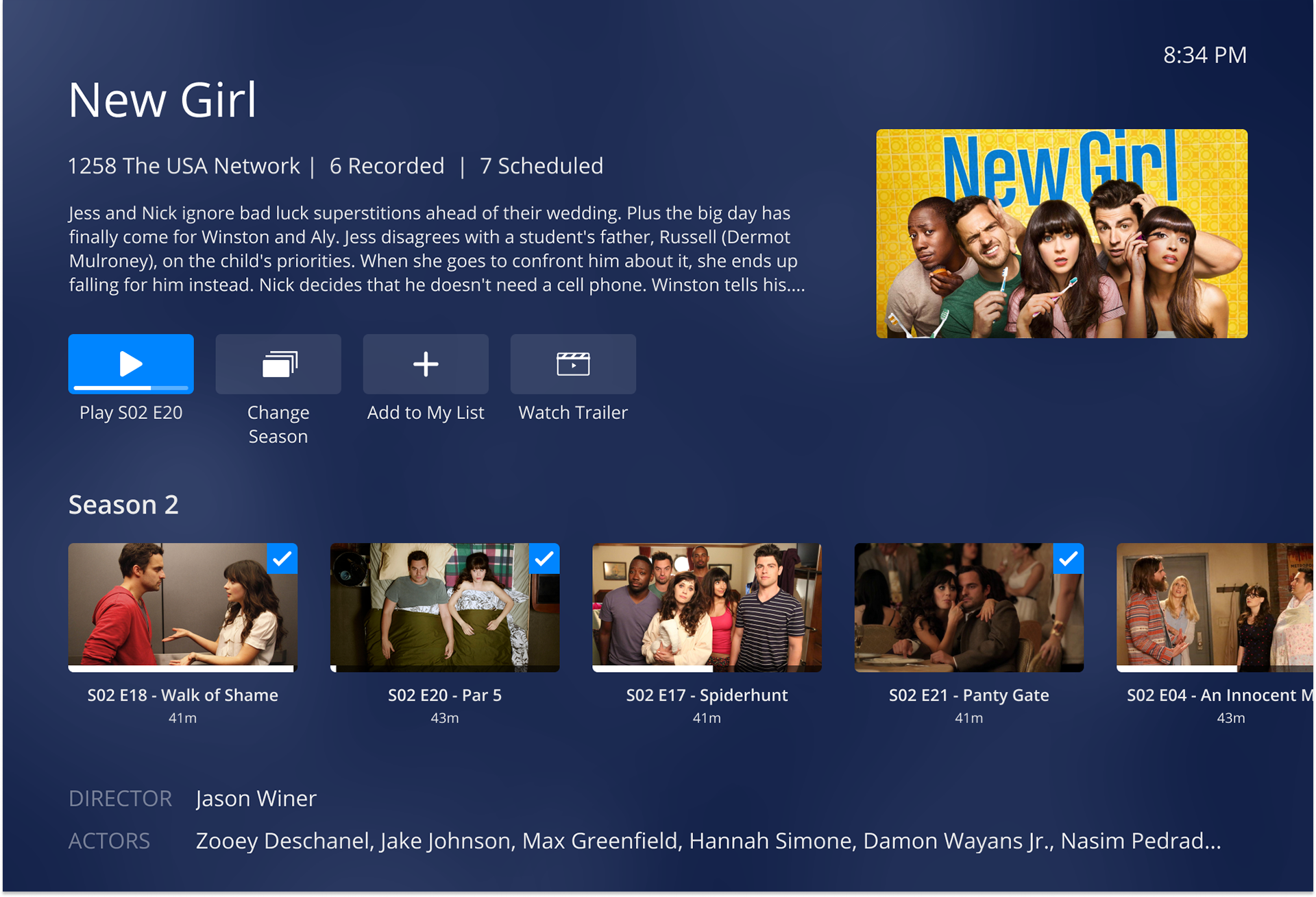
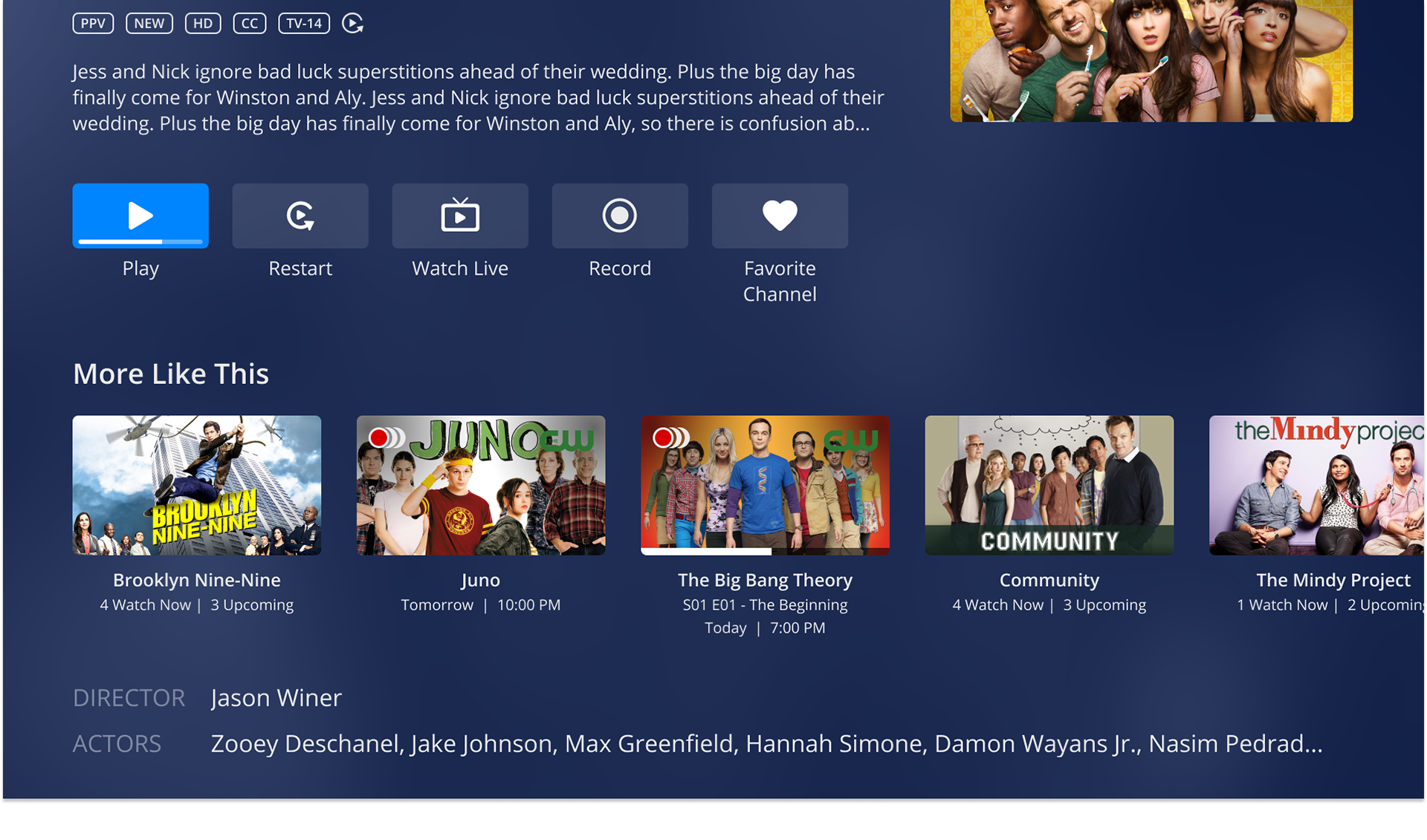
Final Design
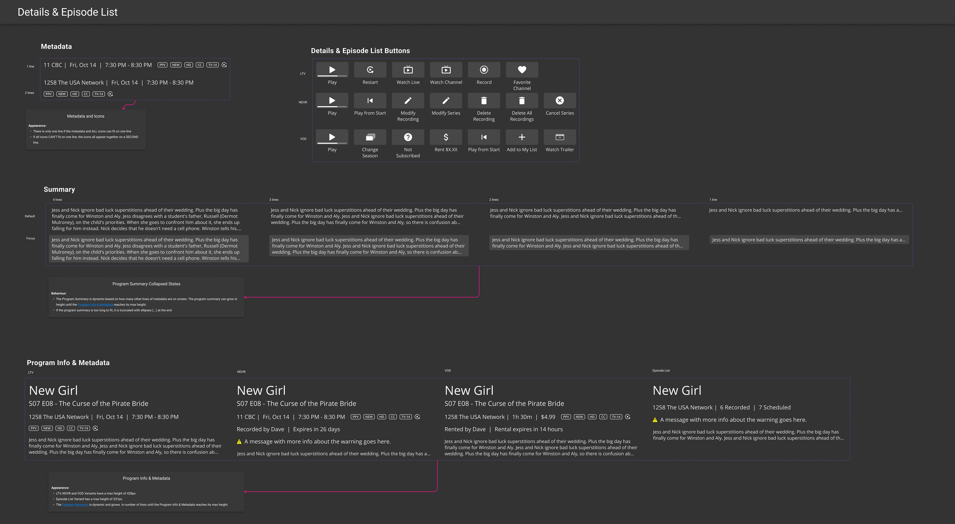
To finalize designs, the component library was updated with the new Details and Episode List components. All edge case screens were considered, including empty list episode results, scrolled screens, and expanded screens. Documentation was completed on Figma and Confluence to hand off the screens to developers.
Details Screen Variations
Live TV Details
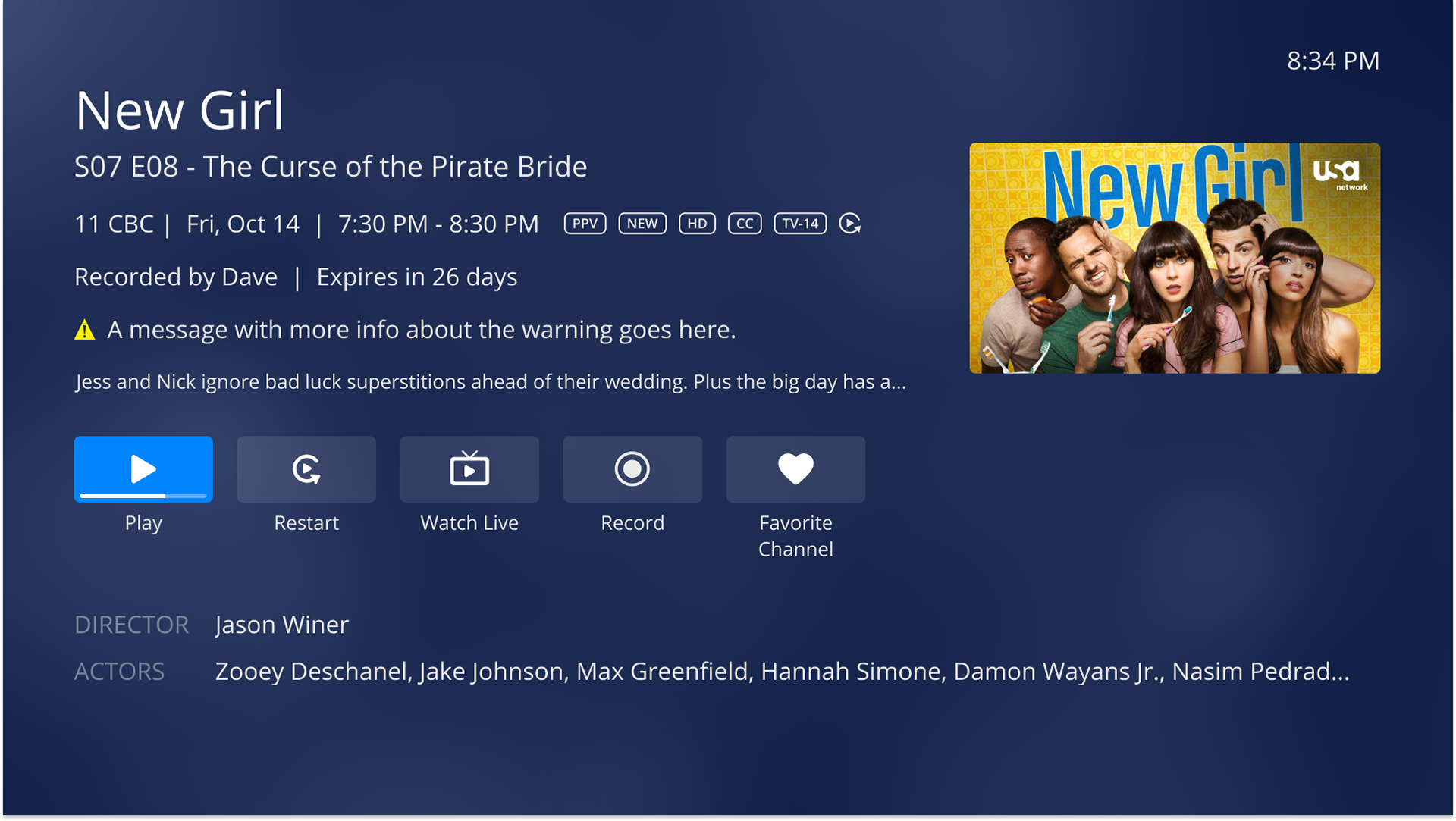
NDVR Details
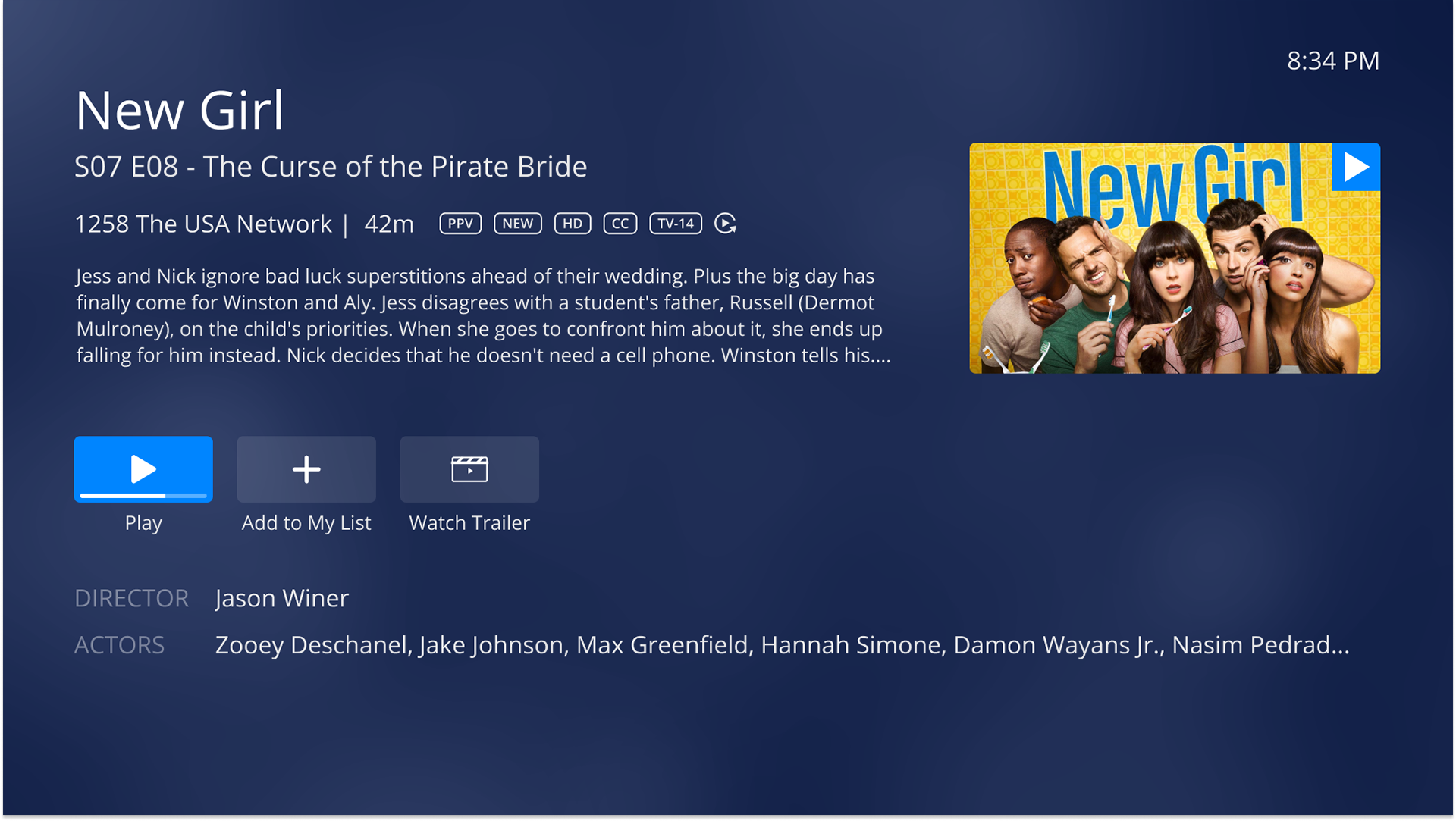
Video on Demand Details
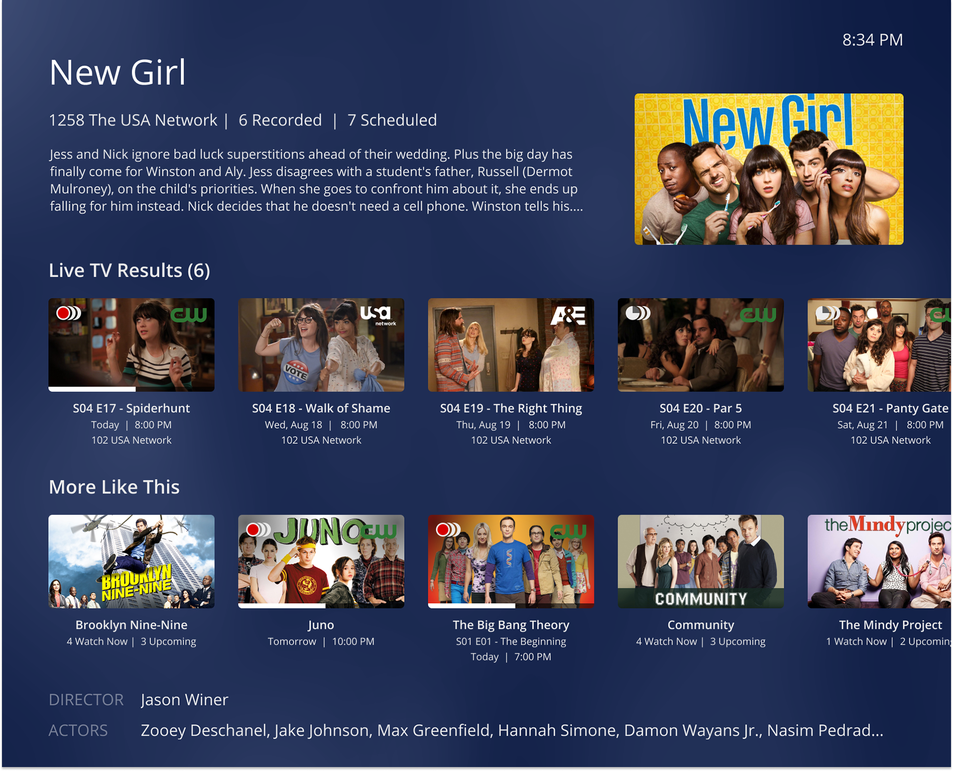
Episode List Variations
Search results Episode List
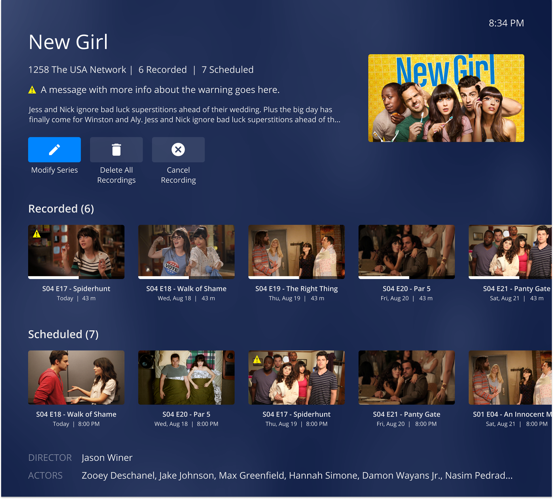
NDVR Episode List
Video on Demand Episode List
Edge Case Screens
Scrolled to bottom
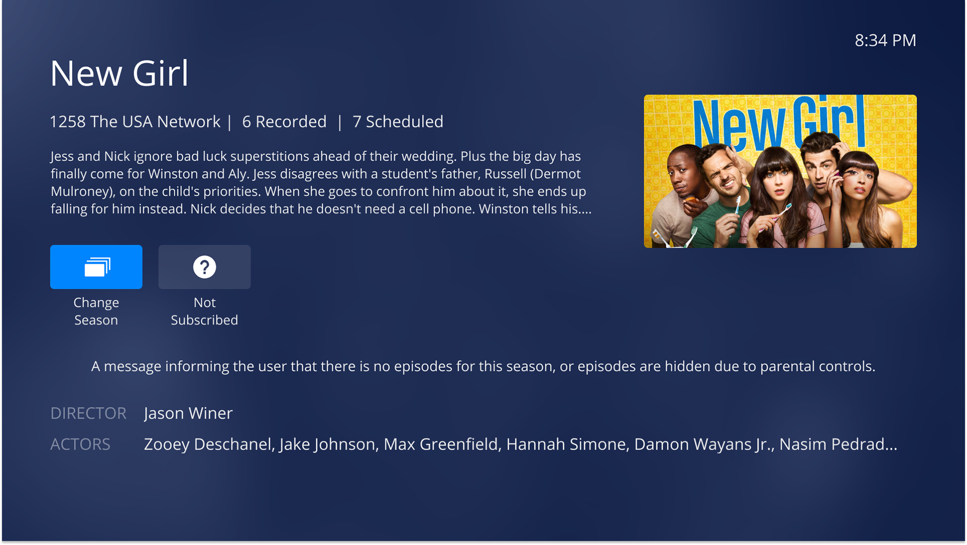
Empty List results
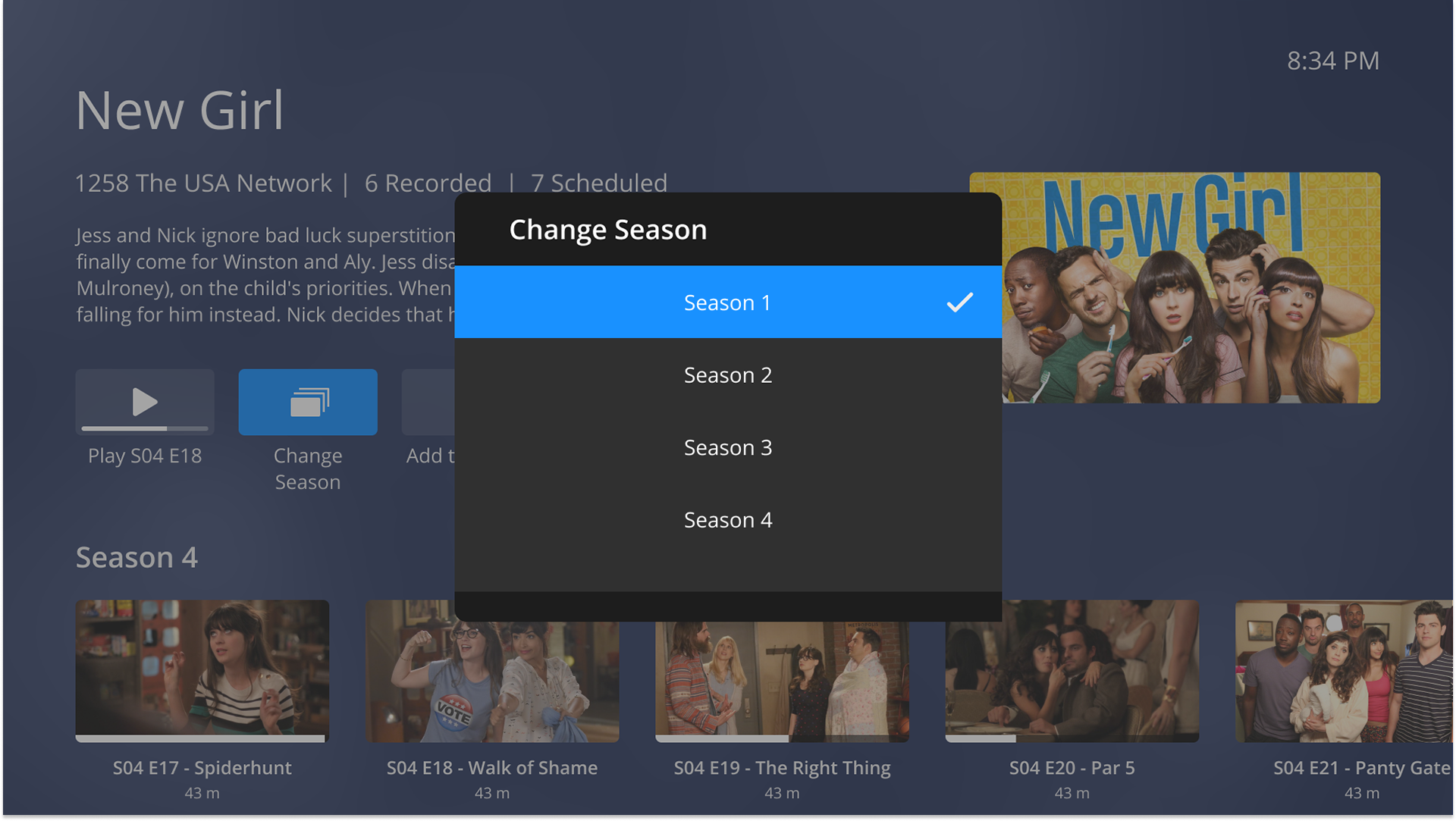
Change Season Popover
Expanded Screen Variations
Overflow expanded screen
'No info' expanded screen
Expanded screen
Figma Documentation Example
Figma Prototype
Use arrow keys to navigate through the prototype
You may also like

